


Turlock Irrigation District
Mobile Education Center
A Fresh Approach
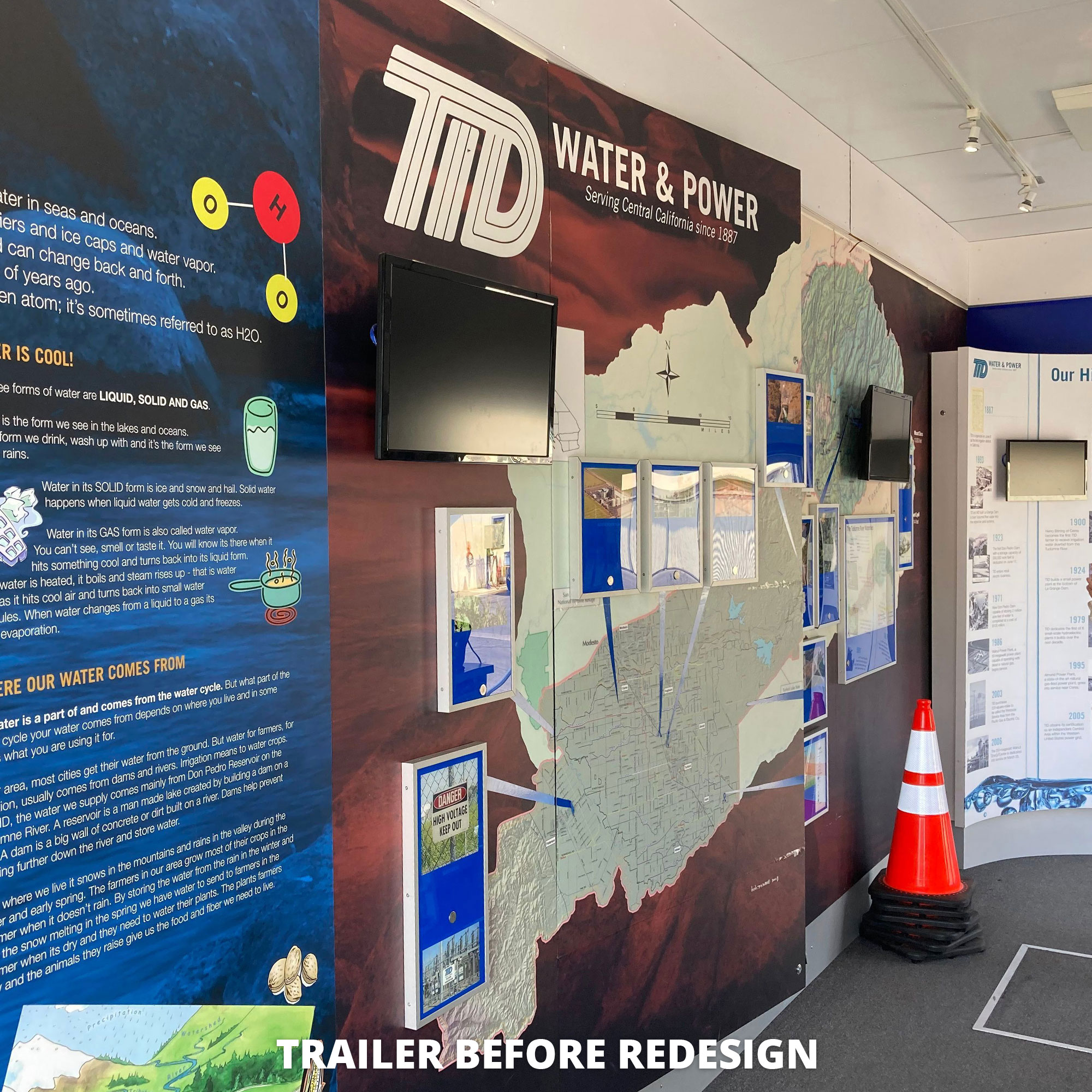
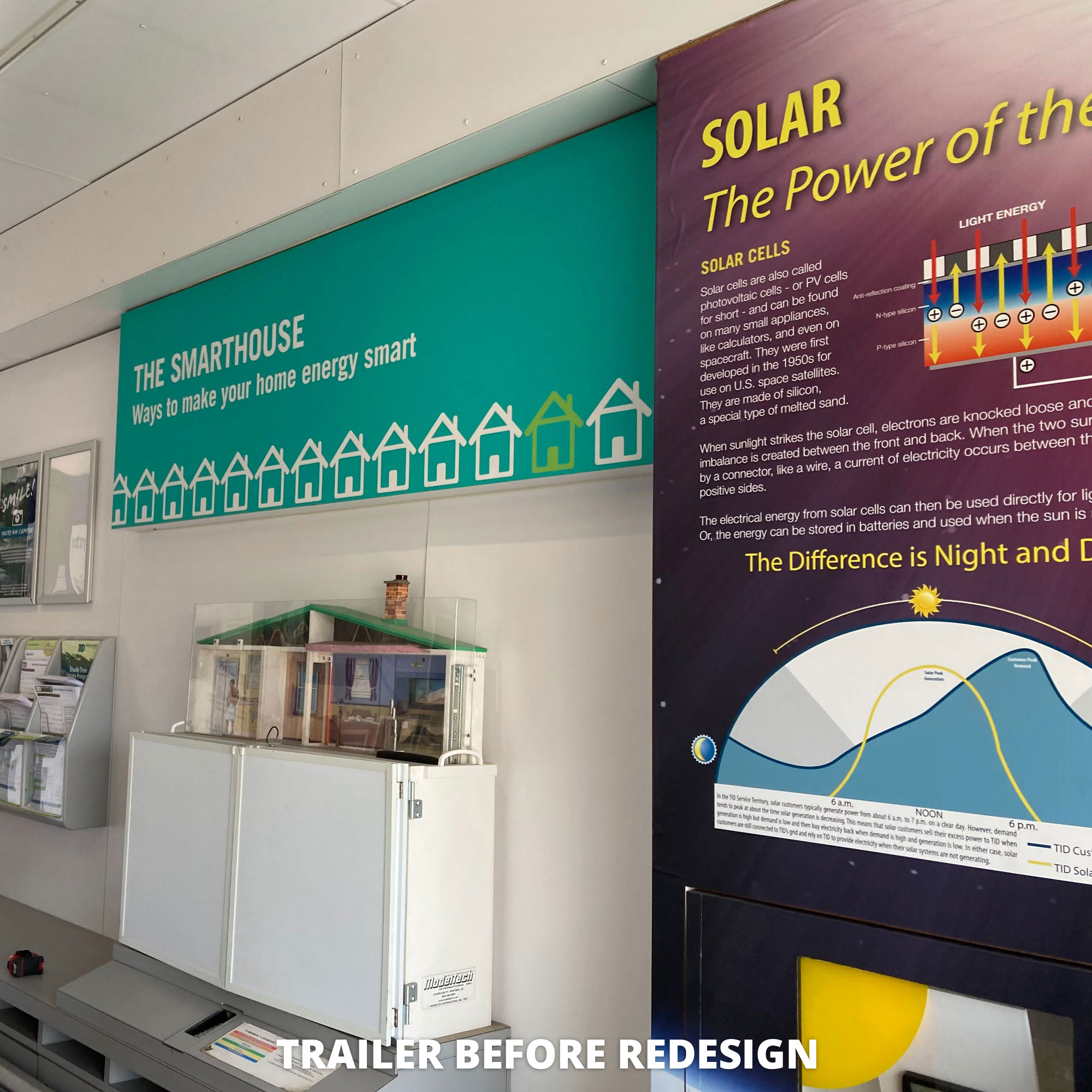
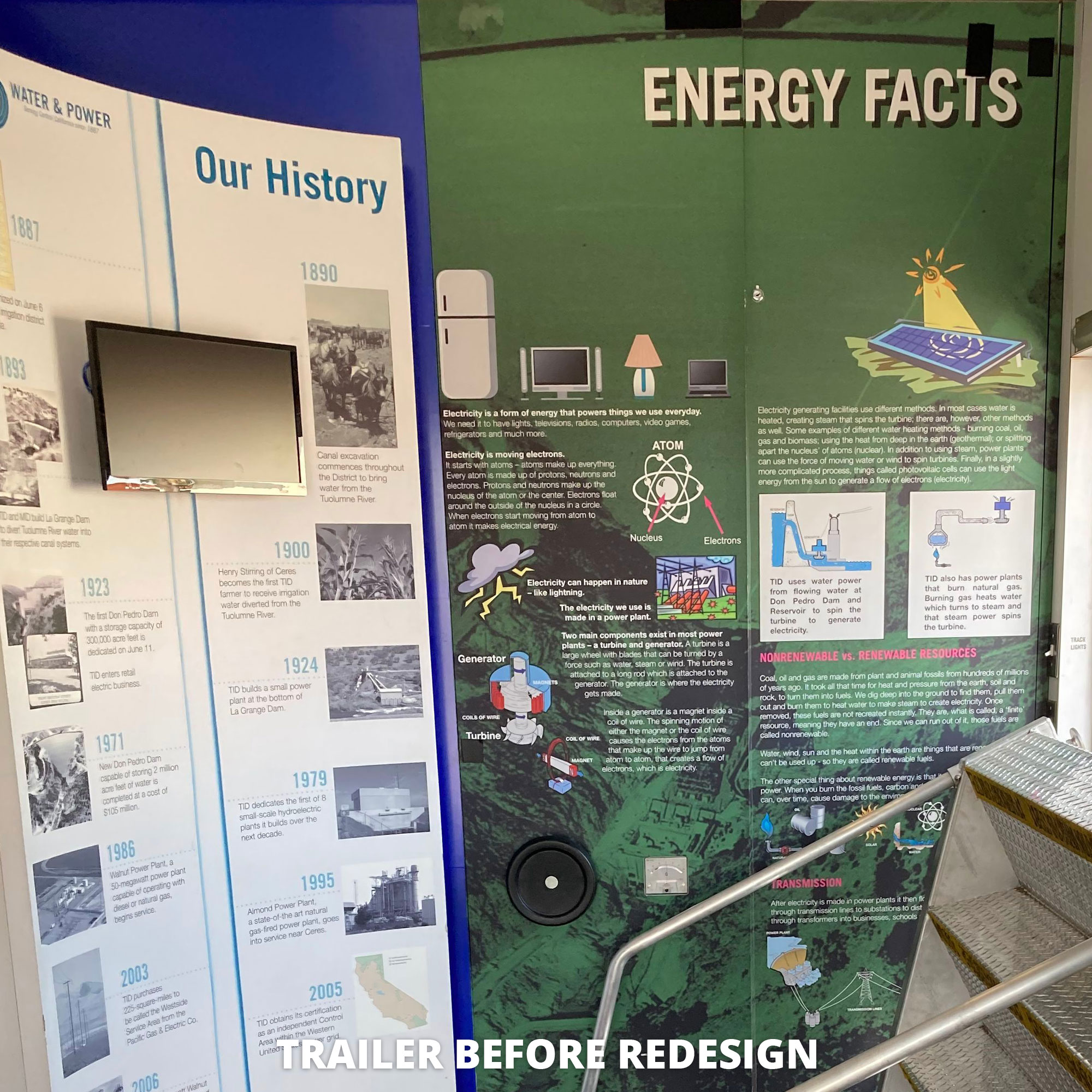
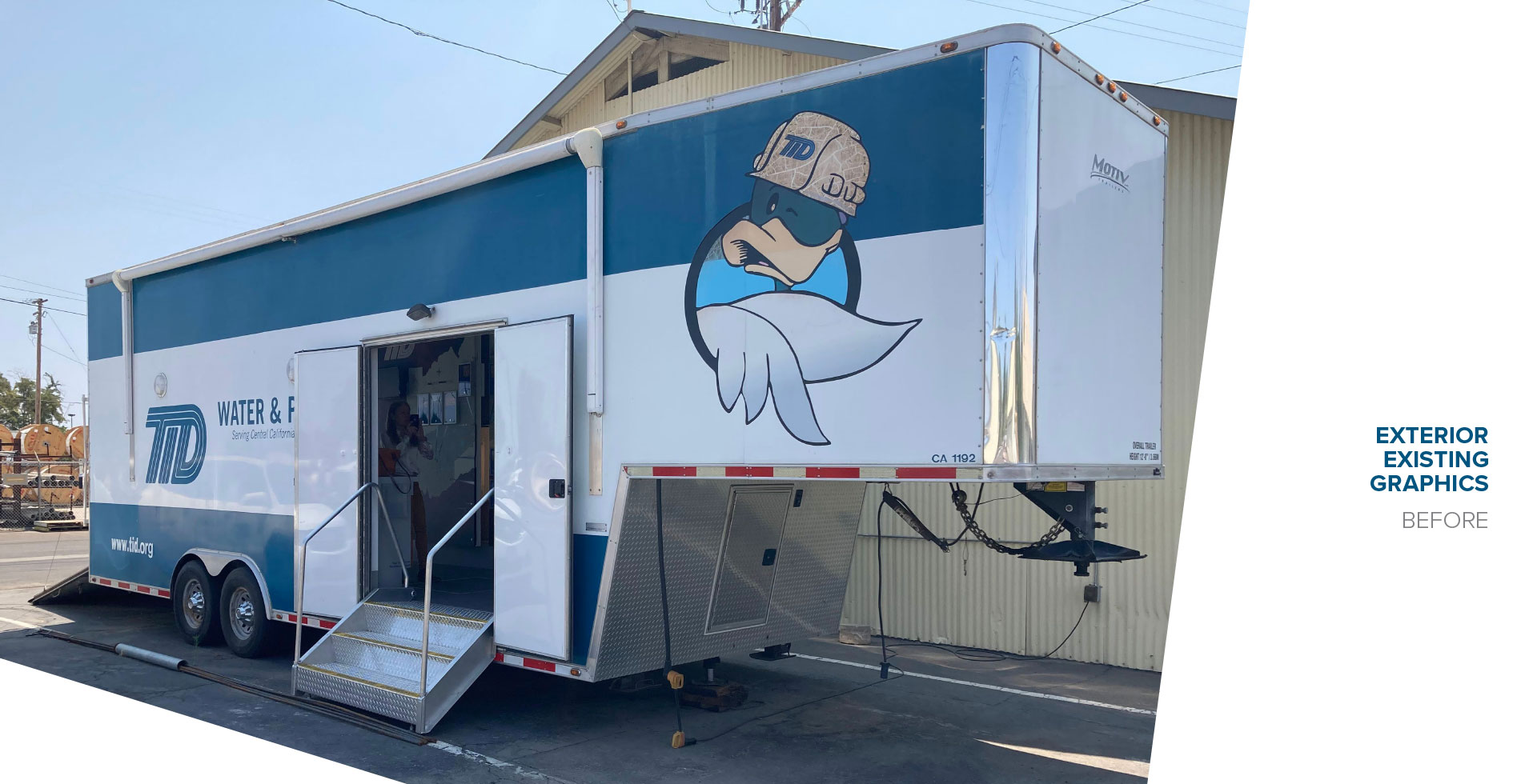
Originally designed by others in 2007, the mobile education center had served the community and a generation of students for nearly 15 years. The existing graphics lacked a cohesive color story; text and interactive elements were too far above and below accessibility reach and readability parameters; and an assortment of generic clip art illustrations detracted from the professional service brand of the utility.
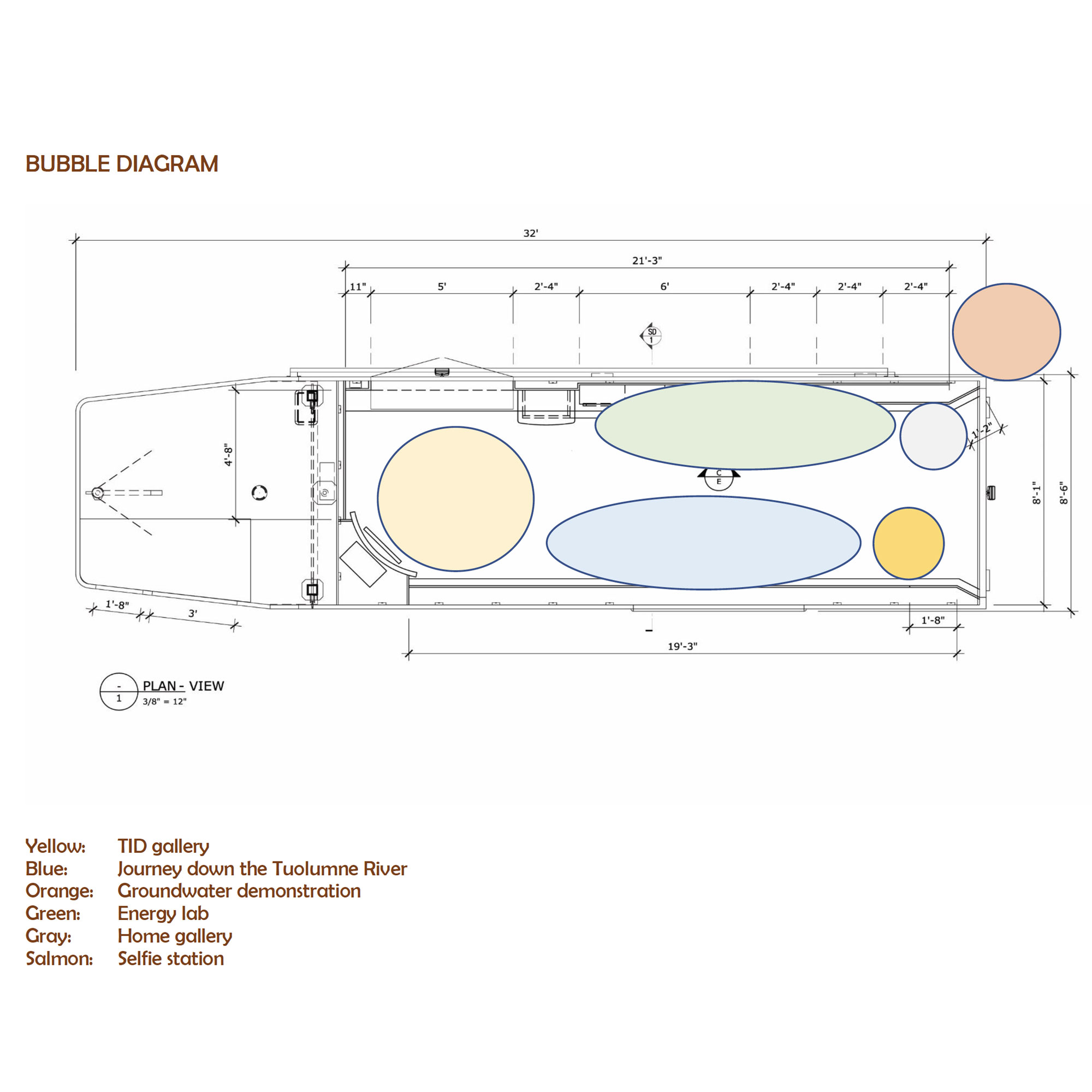
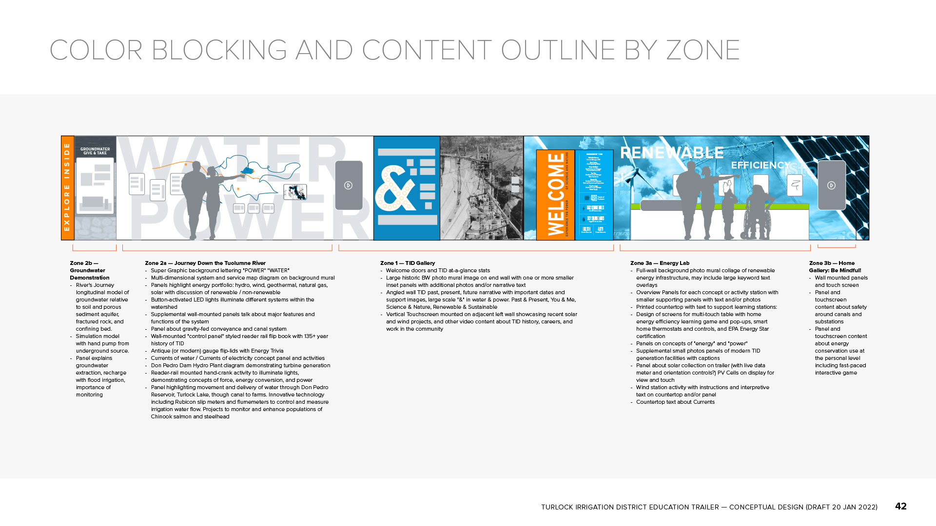
With a new exhibit narrative developed by The Acorn Group in partnership with TID staff, messaging and curriculum goals were outlined and organized by zones within the trailer. James Freed prepared a schematic bubble diagram taking into consideration visitor flow, space requirements, and accessibility. At that stage, Covive began developing an overall graphic approach, leveraging existing TID brand fonts and colors. High-level graphic sketches and mock-ups for all interior walls created a strong visual hierarchy through bold use of color, scale, and contrasts.
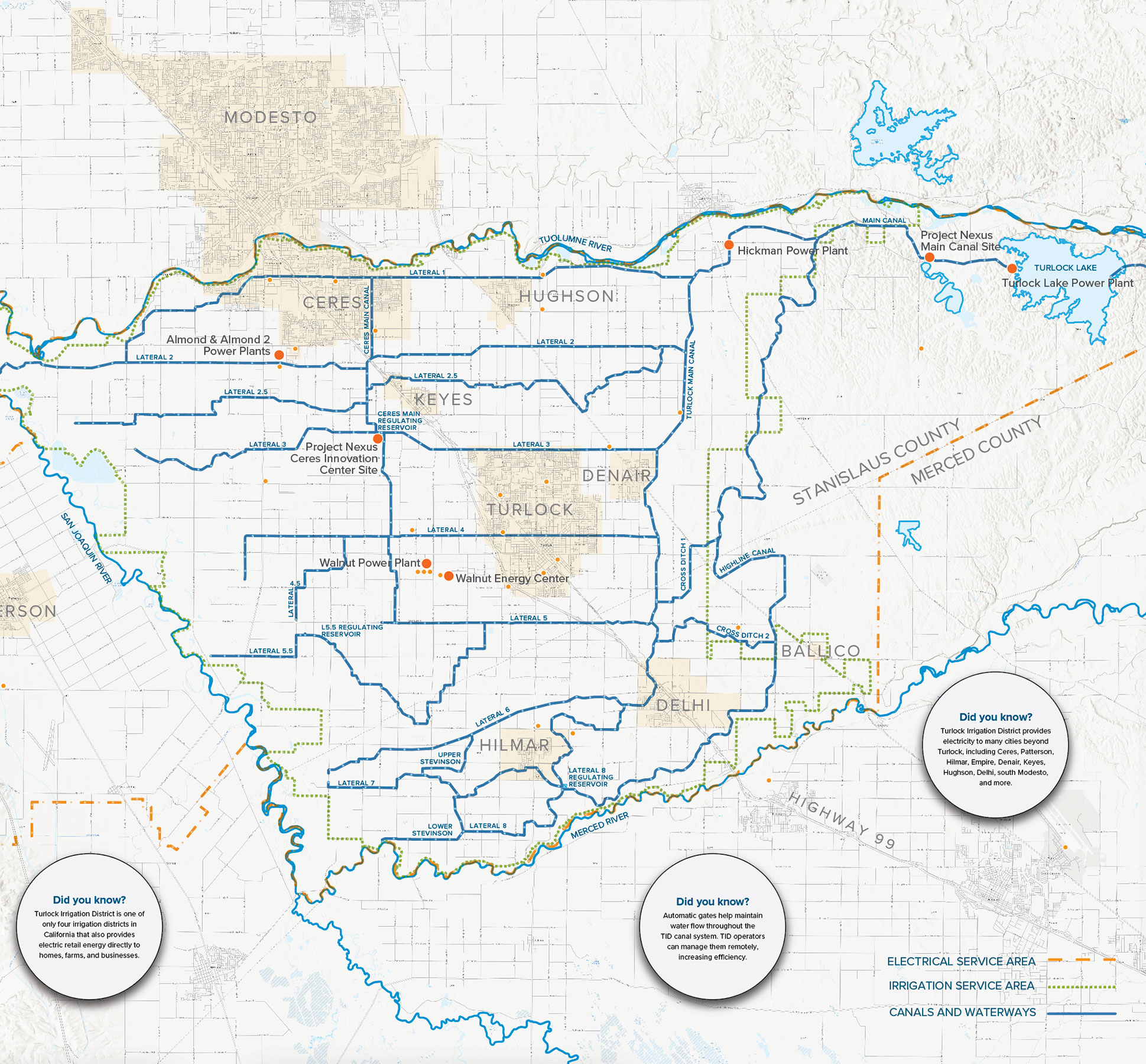
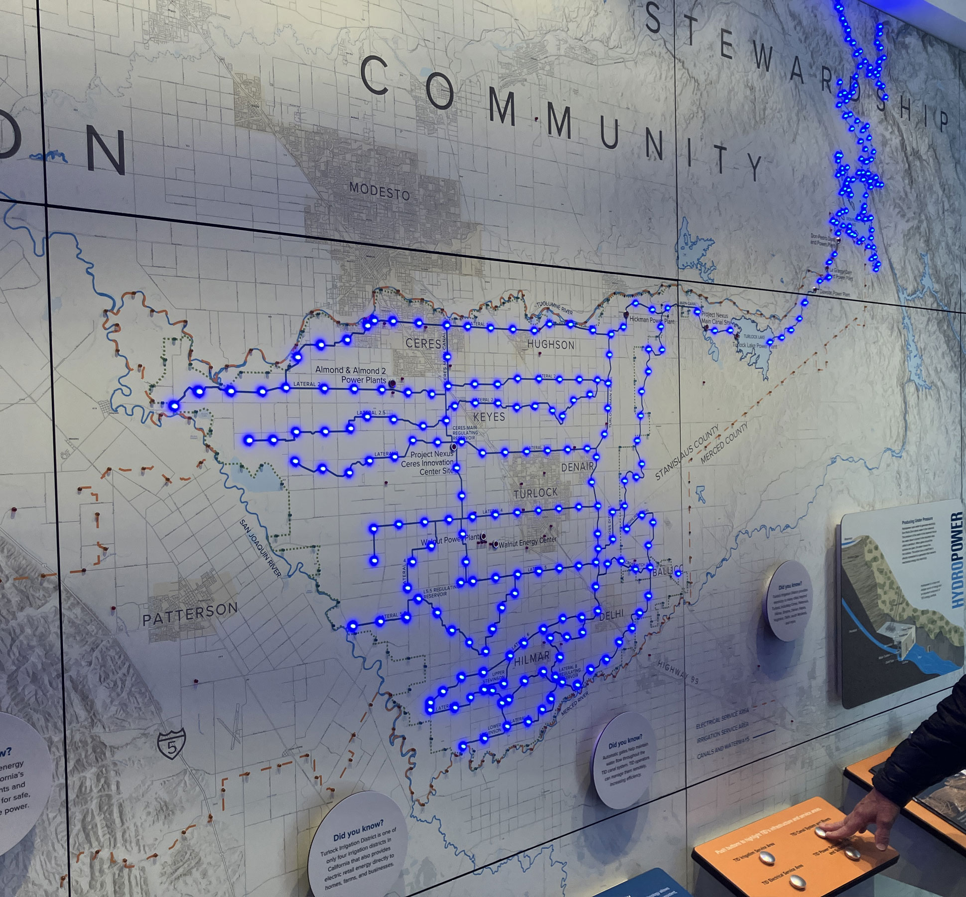
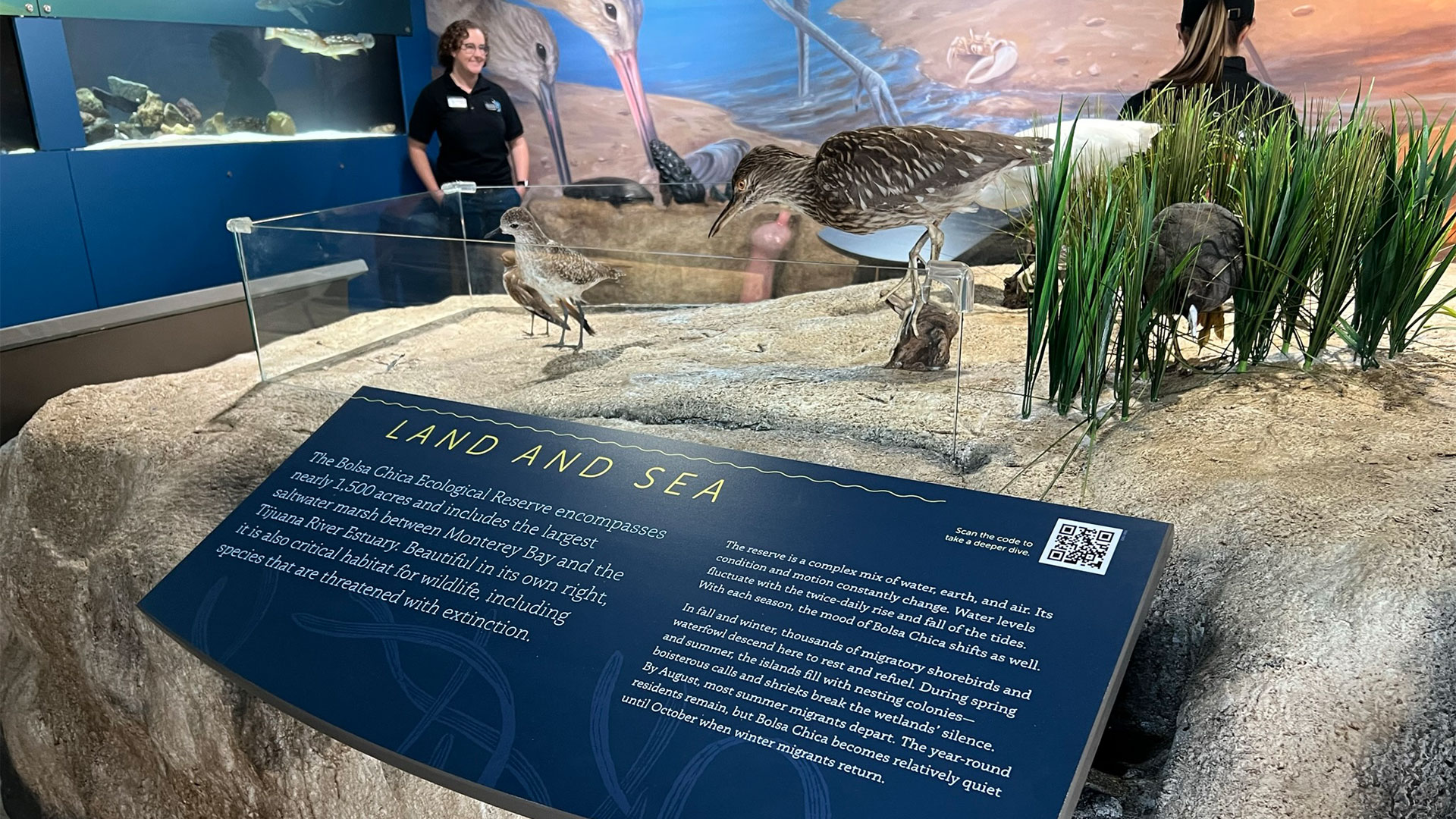
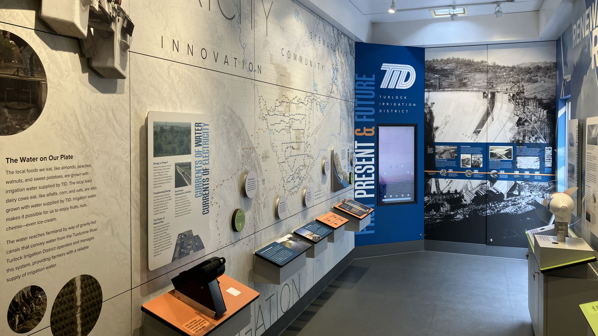
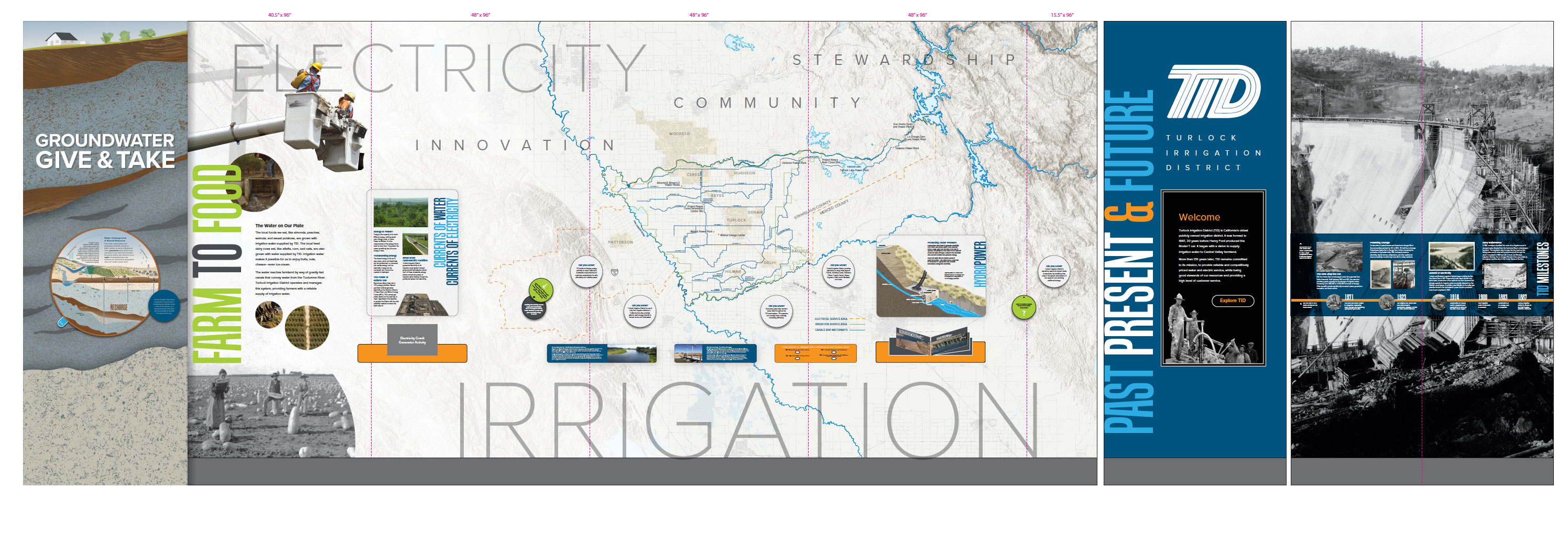
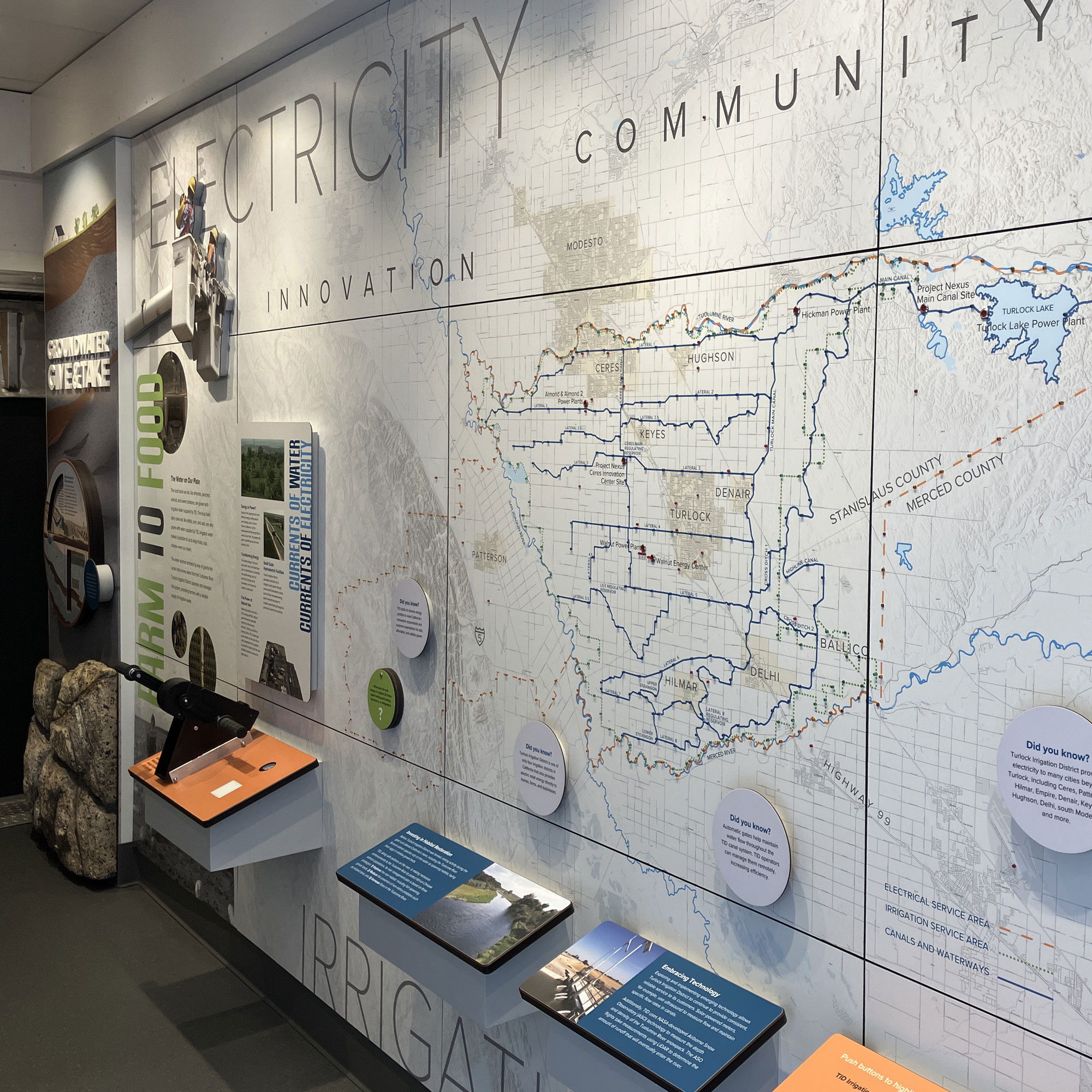
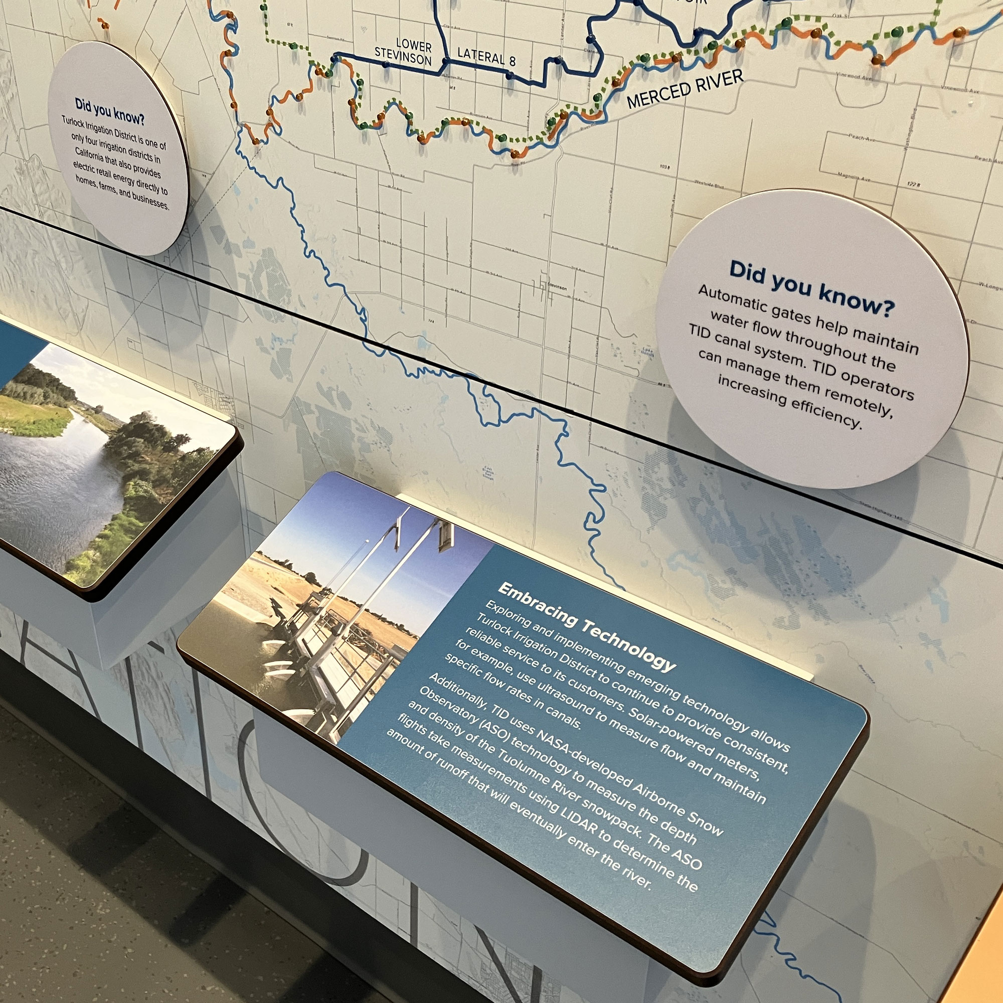
Service Area Wall Map
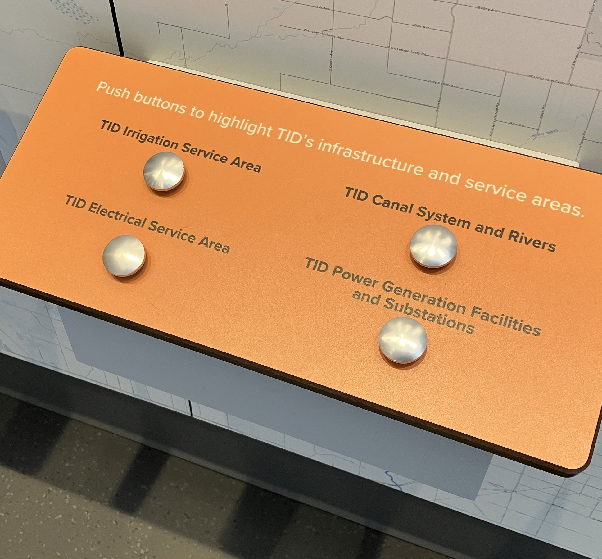
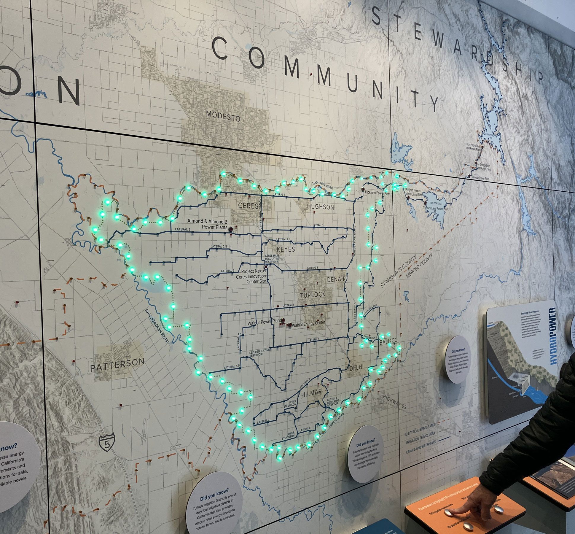
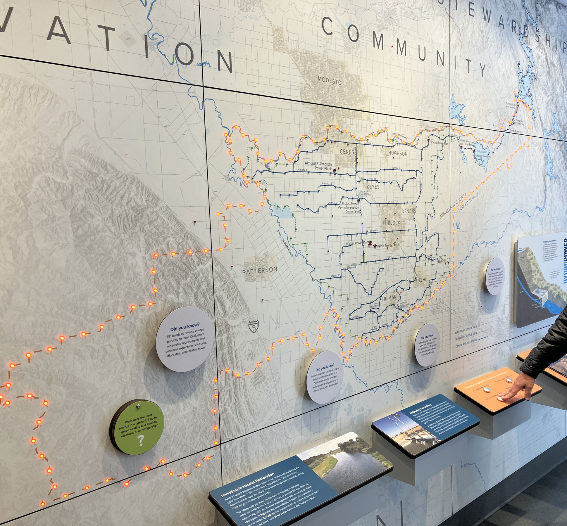
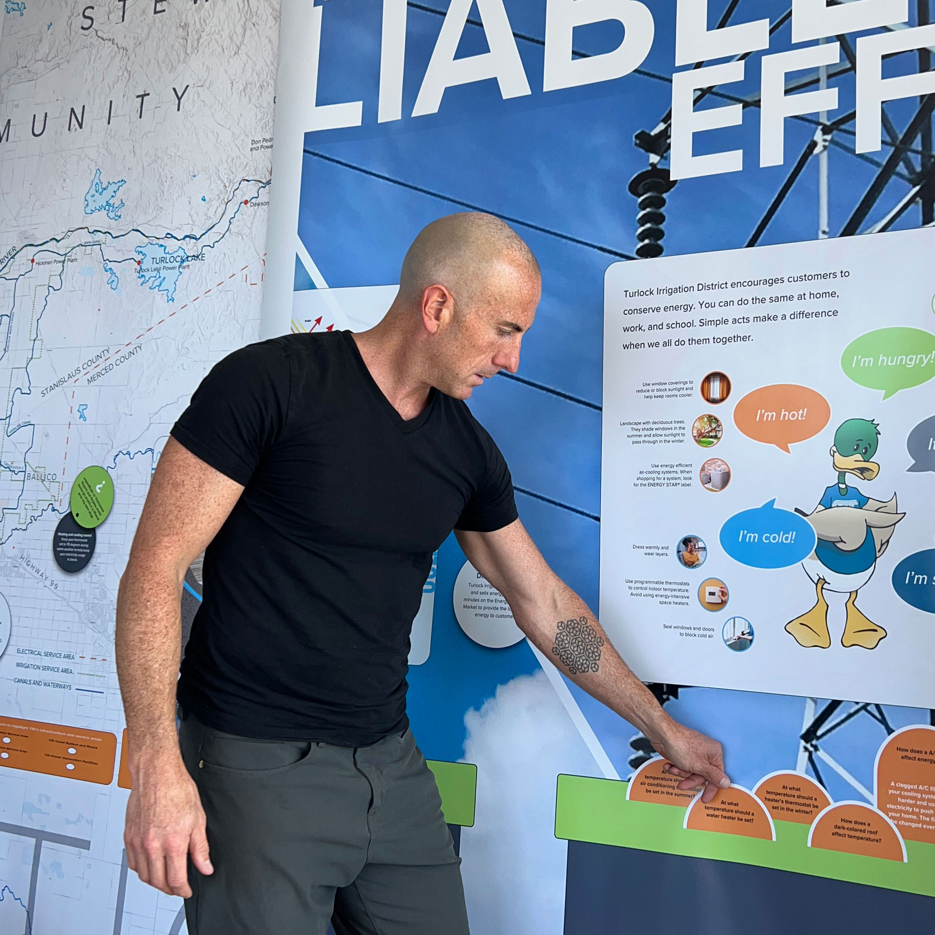
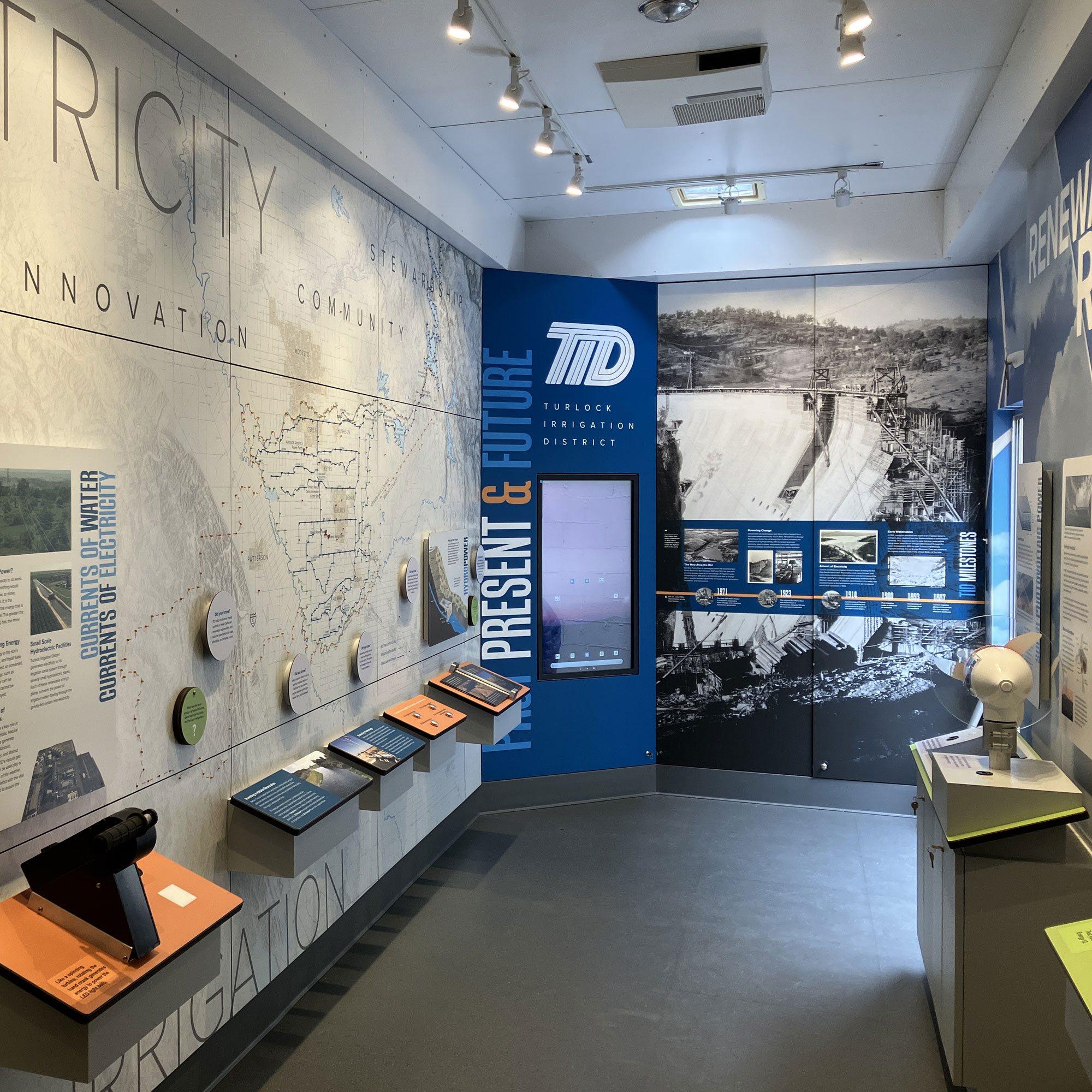
A significant feature of the trailer is a full-wall map showing the electric and irrigation service areas of the utility, as well as the system of canals and waterways which provide hydroelectric generation and irrigation. Extending from the Don Pedro Reservoir in the Sierra Nevada range, along the Tuolumne River, and west beyond the San Joaquin River to Patterson and Interstate 5, the district encompasses 662 square miles and 250 miles of canals. Covive used ArcGIS to output a high-resolution map with a topographic relief base, and other data layers provided by TID. To make the map interactive, a reader rail panel with four labeled buttons activates circuits of LED lights denoting boundaries, waterways, and the locations of nearly 30 power generation facilities and substations.
Custom Illustrations and Timeline
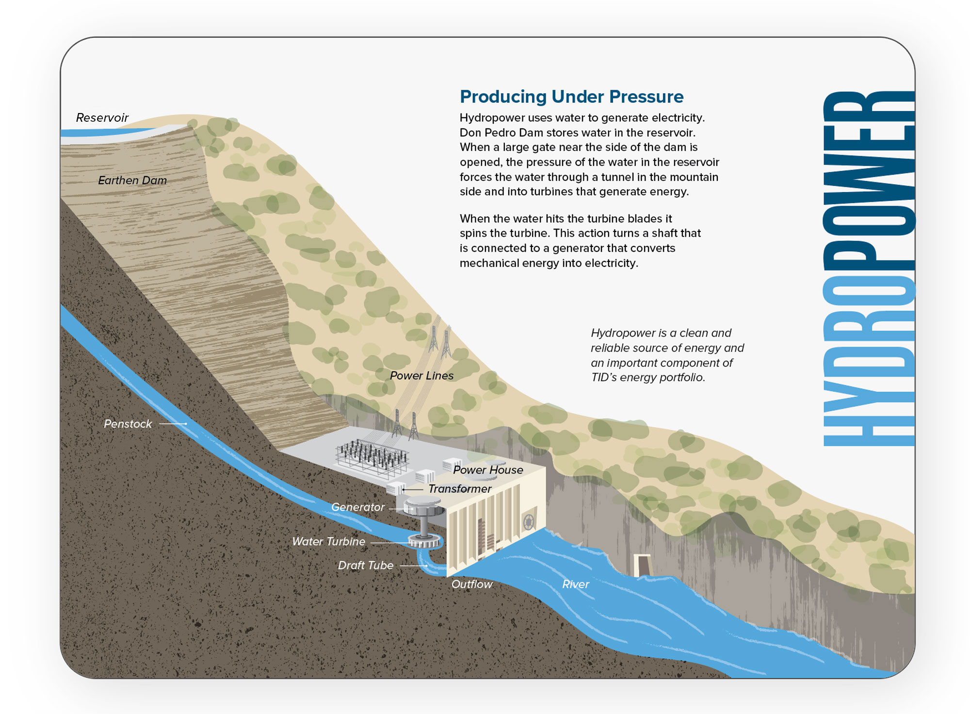
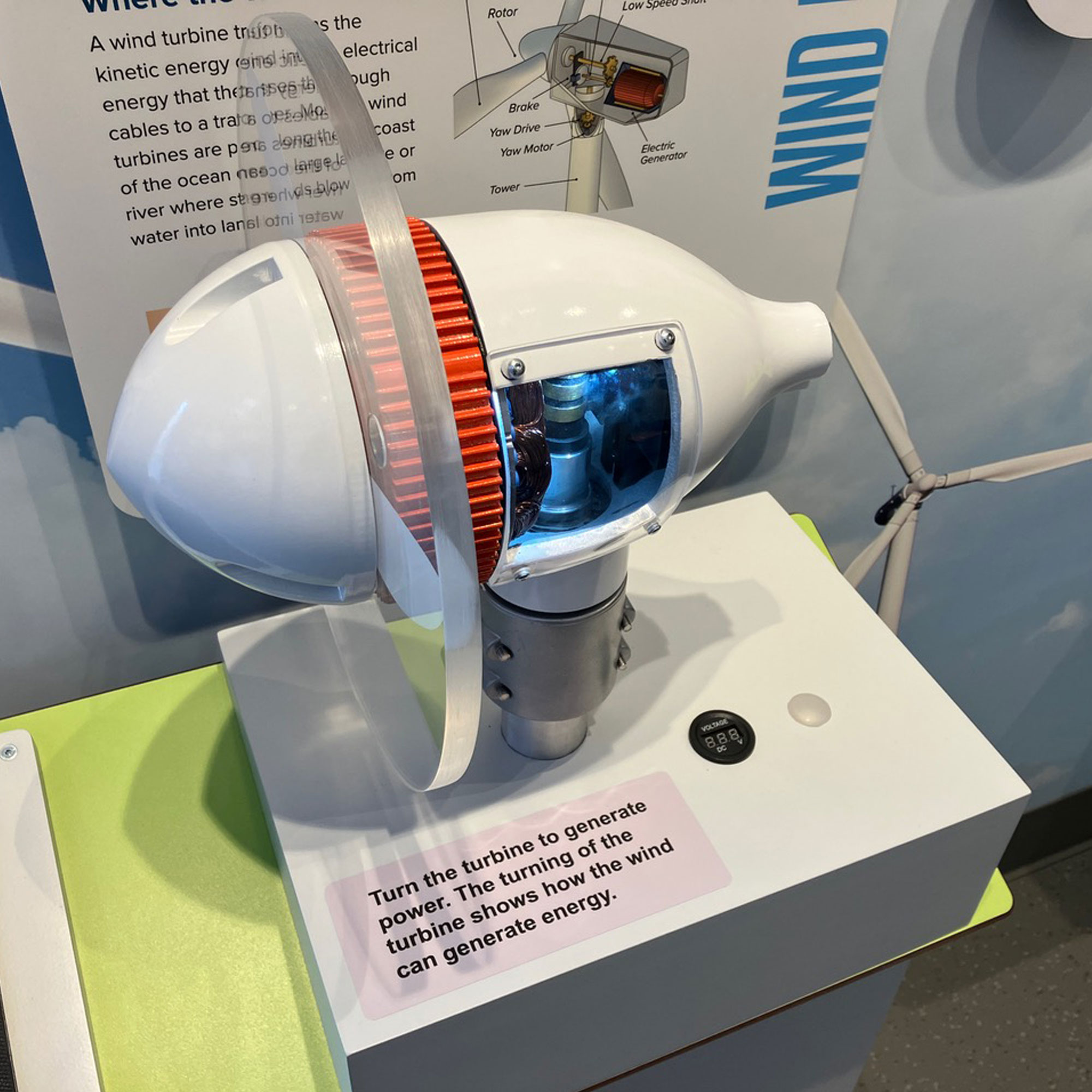
To demonstrate concepts of power generation through hydroelectric, solar, and wind turbine technologies, the design team developed a number of activity stations and custom illustrations. For a section diagram of the hydroelectric dam at Don Pedro Reservoir, Covive referenced photos and other scientific drawings to create a textured panel graphic, labeling key parts of the system.
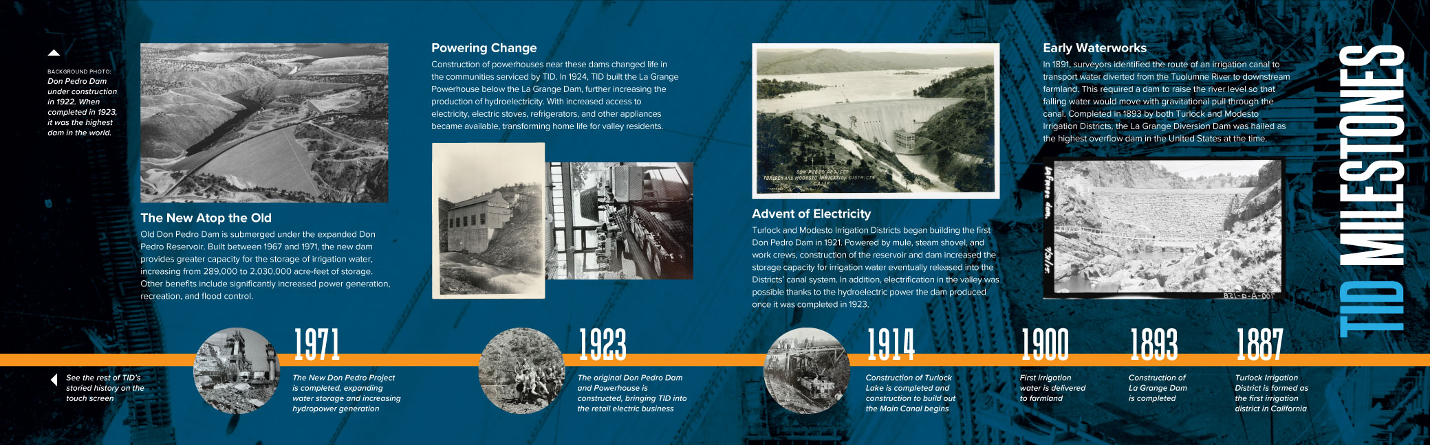
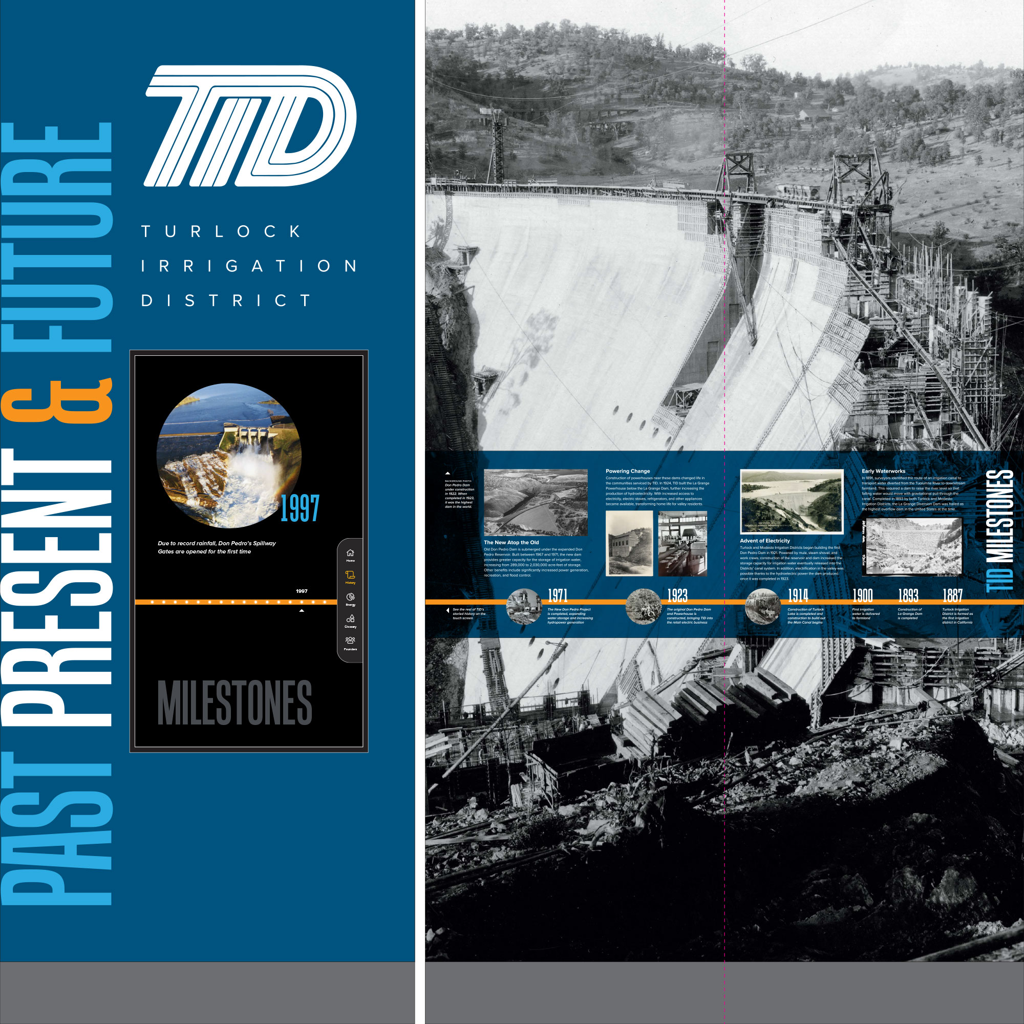
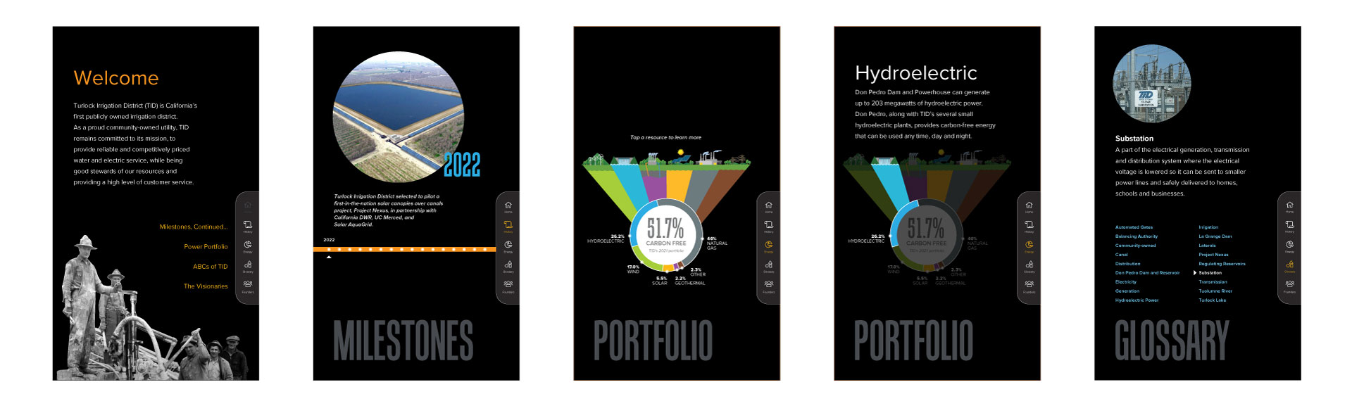
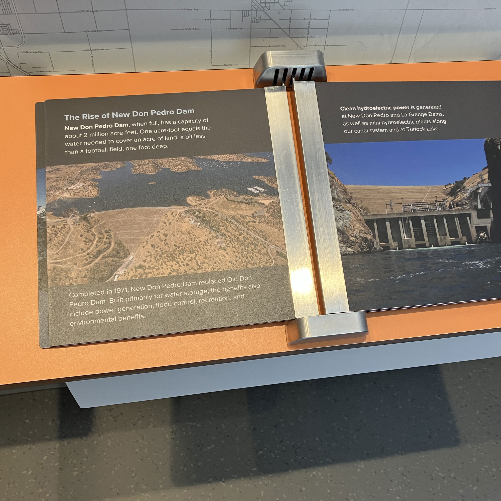
The front end wall of the trailer presents a timeline of milestones from the organization’s 135-year history, which includes significant infrastructure projects and adaptations to keep up with technology. Overlaid on a large background photo of an early dam construction project, the timeline runs from right (near the side entry door) to left, and continues onto a virtual timeline presented on the adjacent touchscreen, which includes recent achievements and allows for future digital additions.
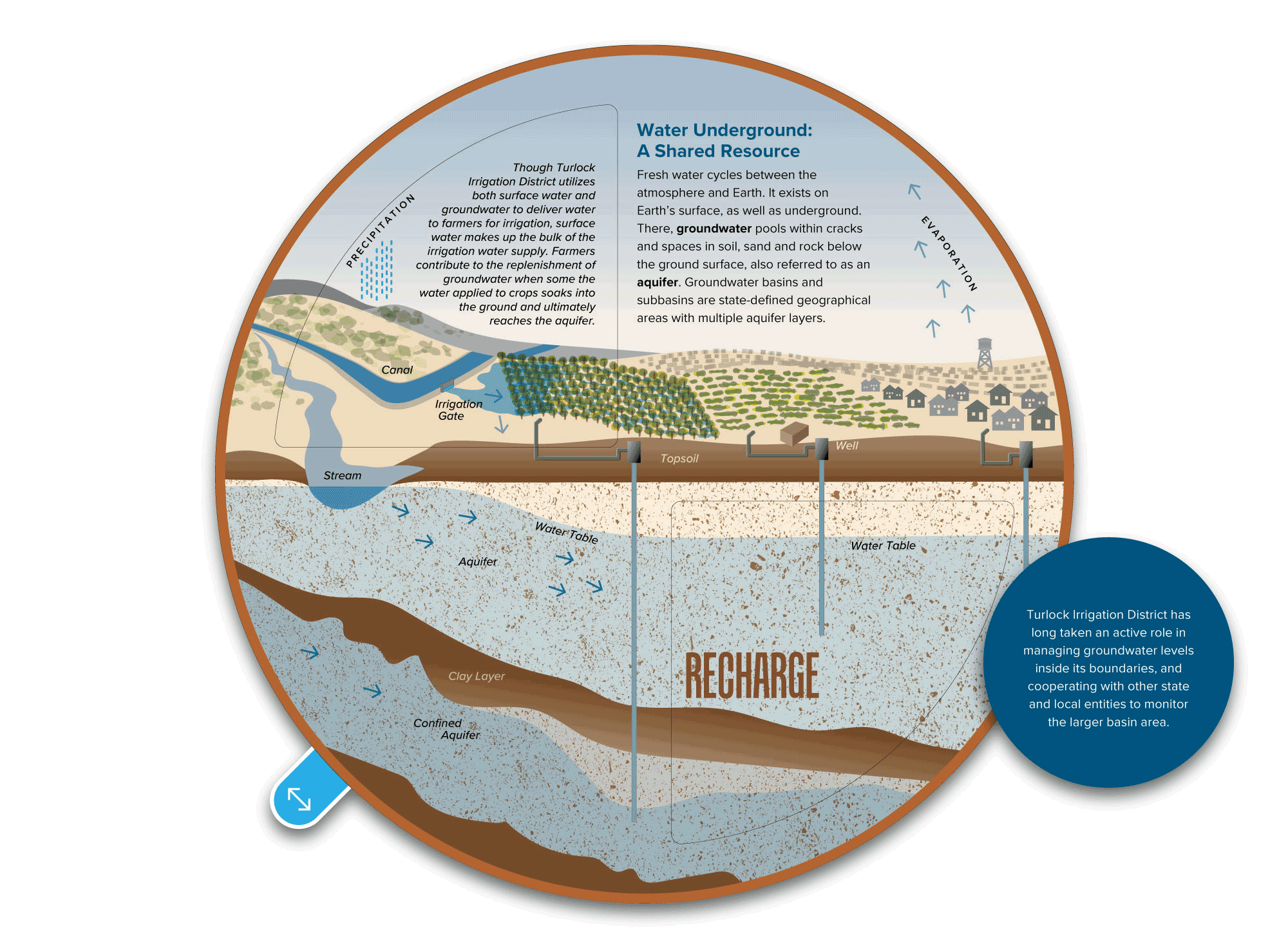
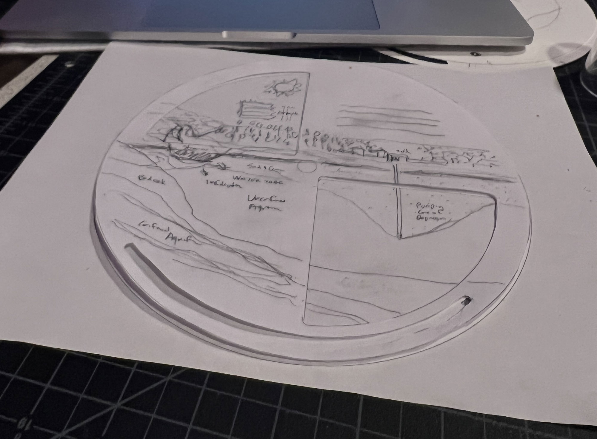
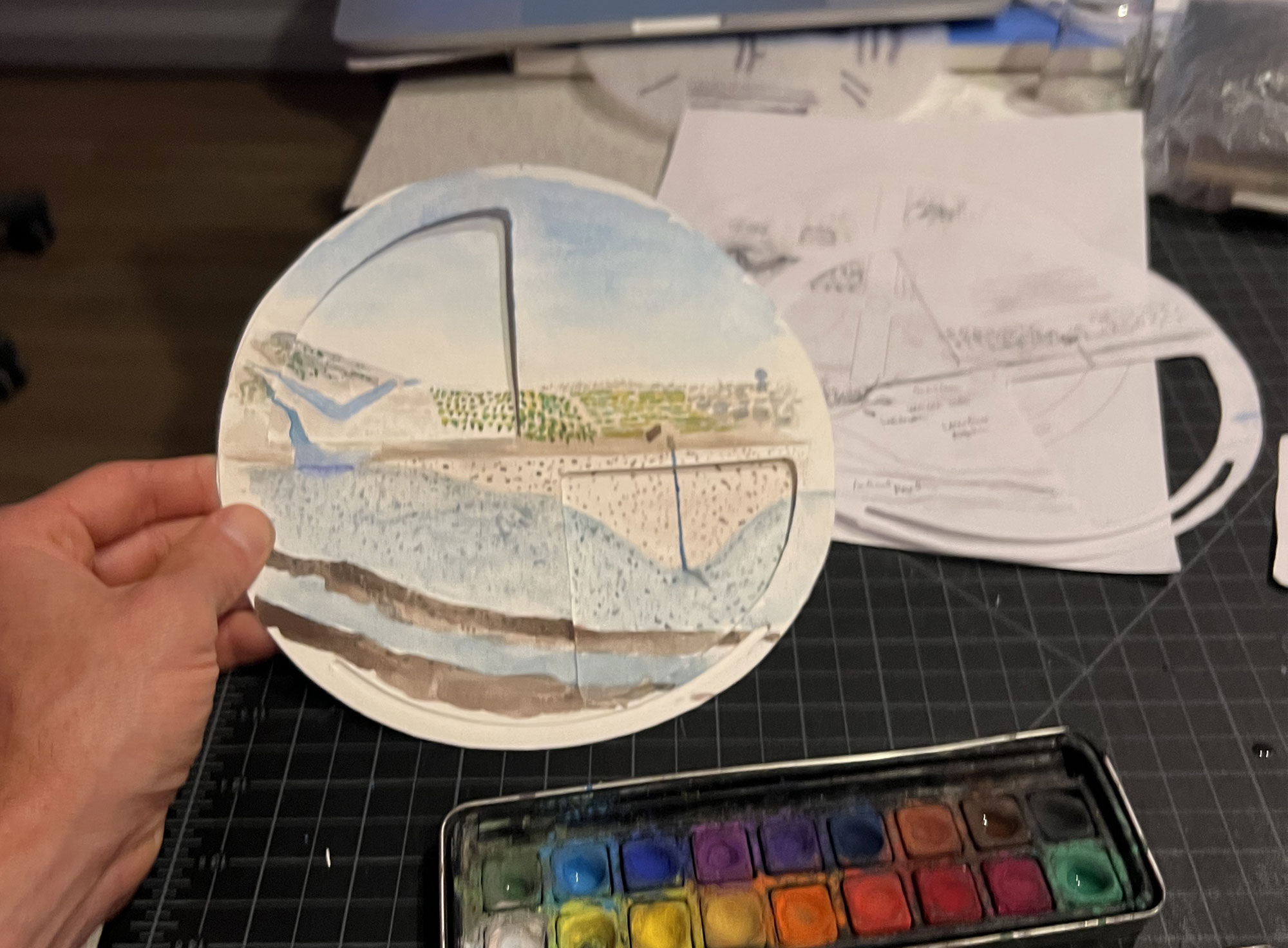
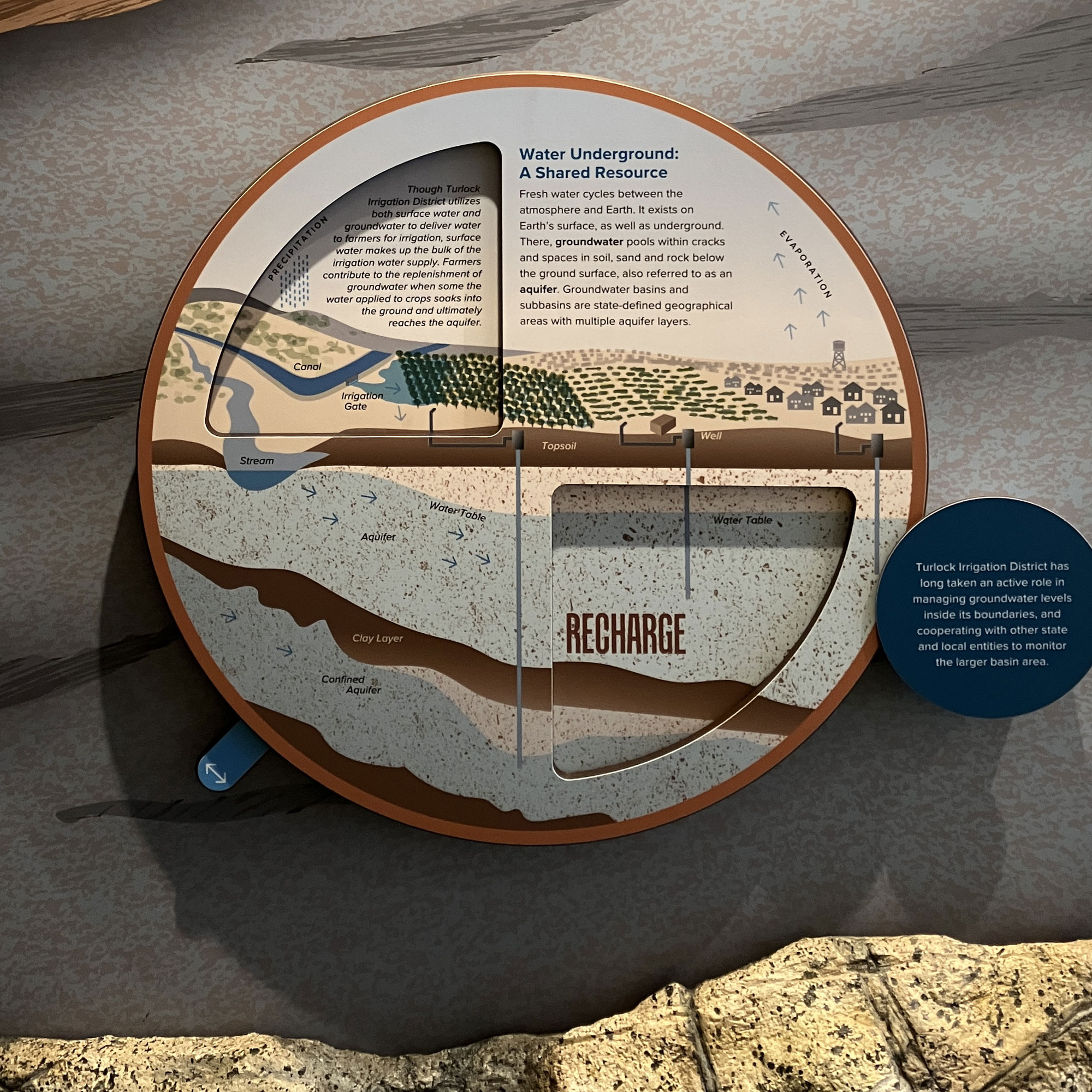
Groundwater Radial Diagram
The subject of groundwater is complex in the arid Central Valley which depends on water for farming and ever-growing communities. As a utility which delivers surface runoff water from the mountains via lakes and canals for vast agricultural use, balancing demand with available supply sometimes requires farmers to rely on water found in aquifers below ground. While rain and irrigation can recharge aquifers, recent dry years have seen severe depletion of groundwater. To illustrate this give and take relationship, Covive developed a radial diagram with two positions controlled by a rotating toggle wheel. The concept was first developed as sketches on paper, then in watercolor to establish a natural look, and finally drawn as a vector illustration with labels. The wall-mounted diagram sits within a larger floor to ceiling panel which includes a sculpted rockwork base and forced perspective mural illustration which places the viewer deep underground.
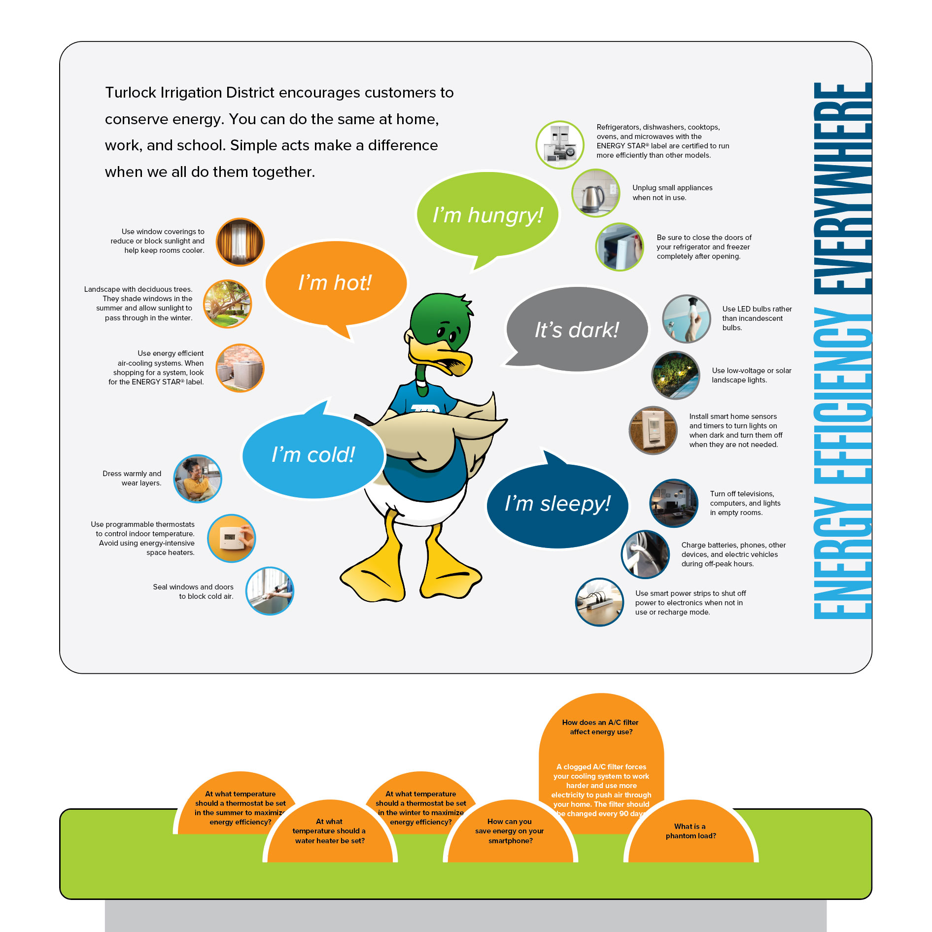
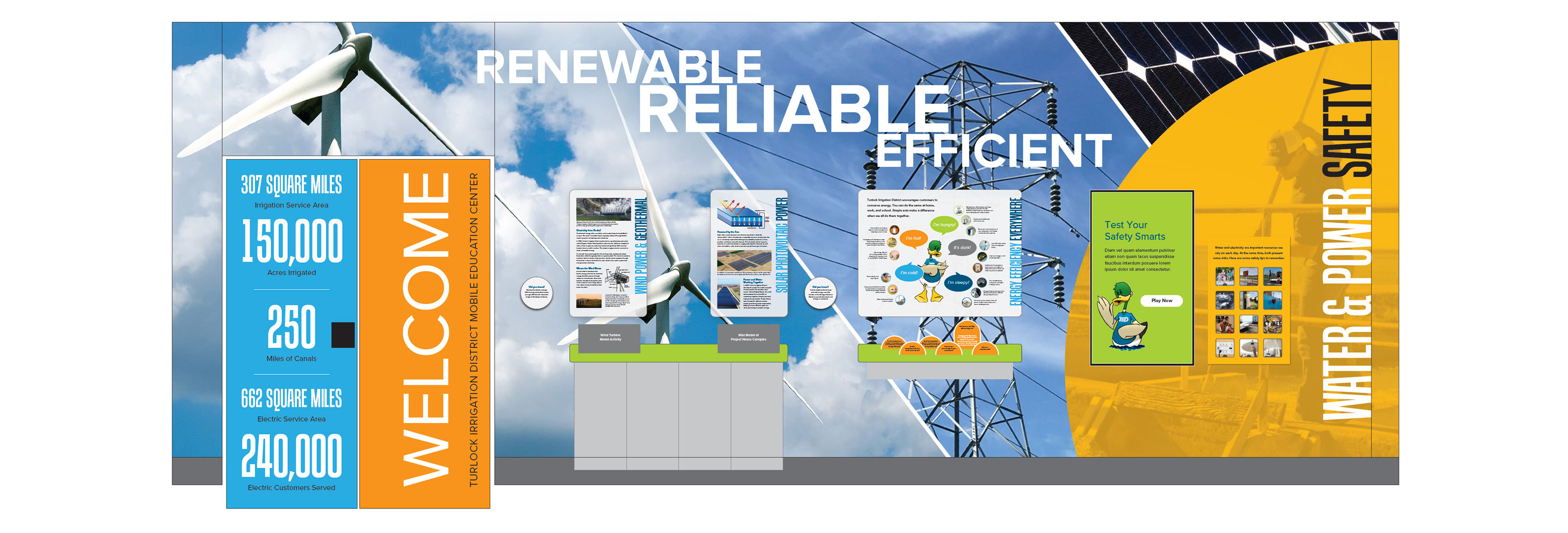
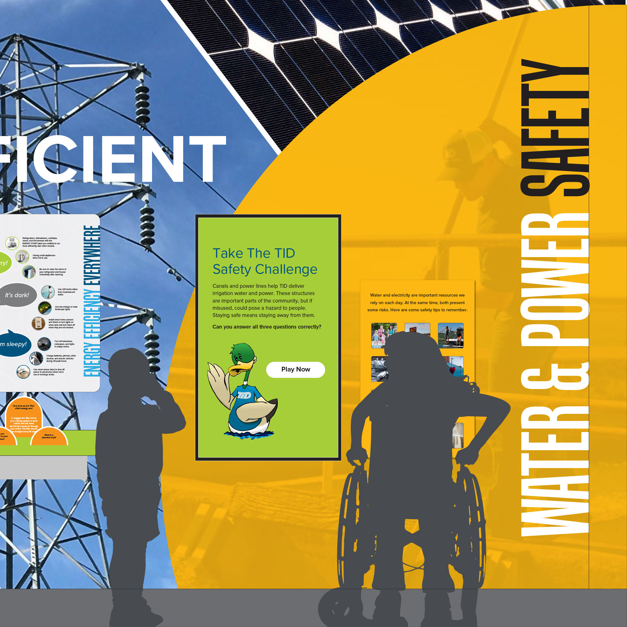
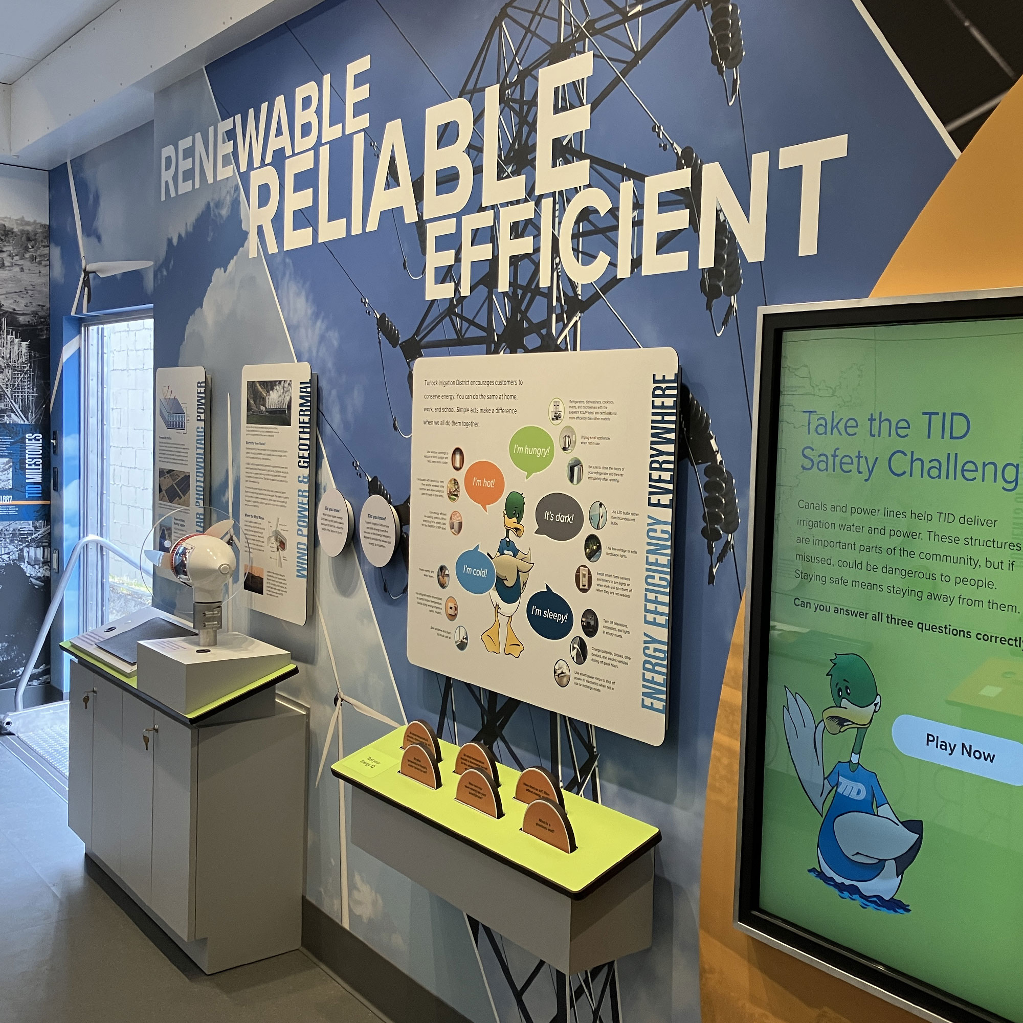
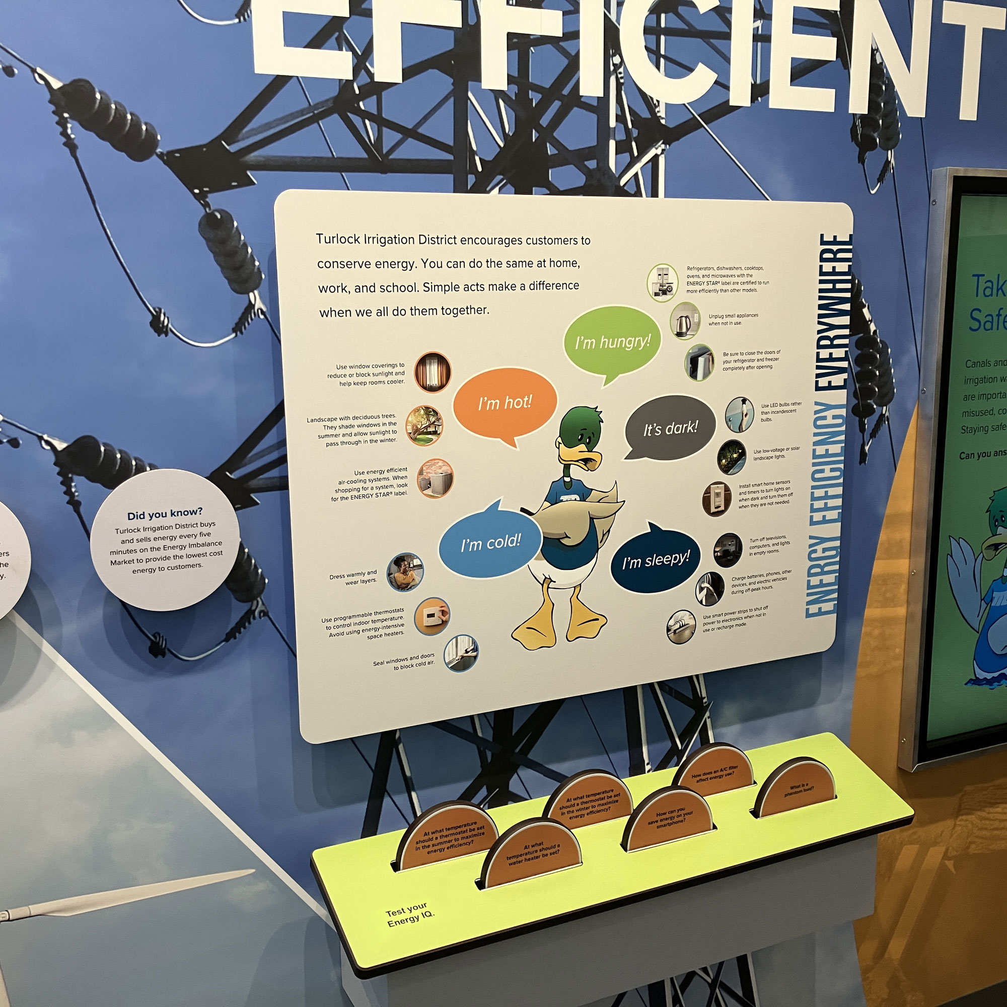
Needs-based Energy Efficiency
The previous iteration of the trailer included a three-story doll house labeled with energy efficiency measures. This concept has been used many times before. In addition to problems of equity connoted by a large-footprint home, many of these efficiency measures put the focus on technology and/or scarcity. To completely rethink the conversation around energy efficiency, Covive presented an alternative needs-based lens for viewing energy use. Centered around TIDs existing mascot Dexter the Duck, speech bubbles present feeling statements: “I’m hot!” “I’m hungry!” “I’m cold!” “It’s dark!” “I’m sleepy!”, each highlighting three low/no-tech solutions for meeting these needs with minimal energy consumption. This approach is meant to shift the reader’s consciousness to targeted alternatives versus excessive wasteful consumption.
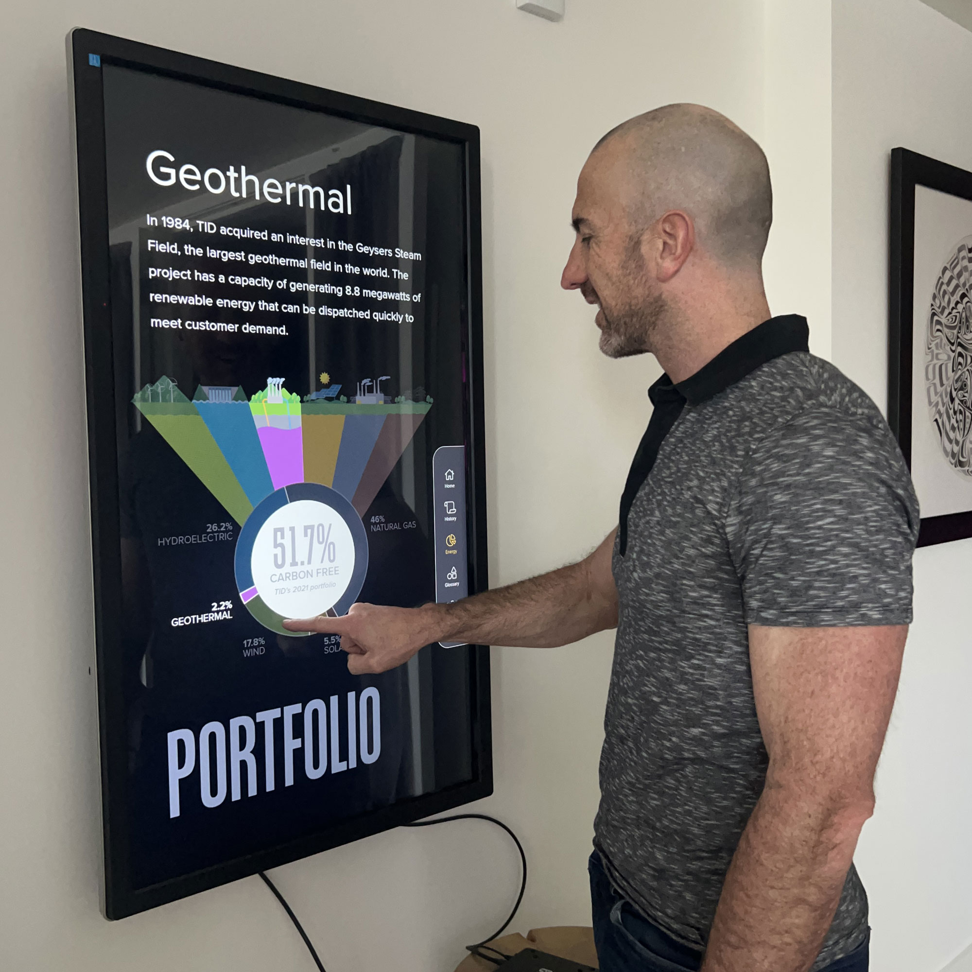
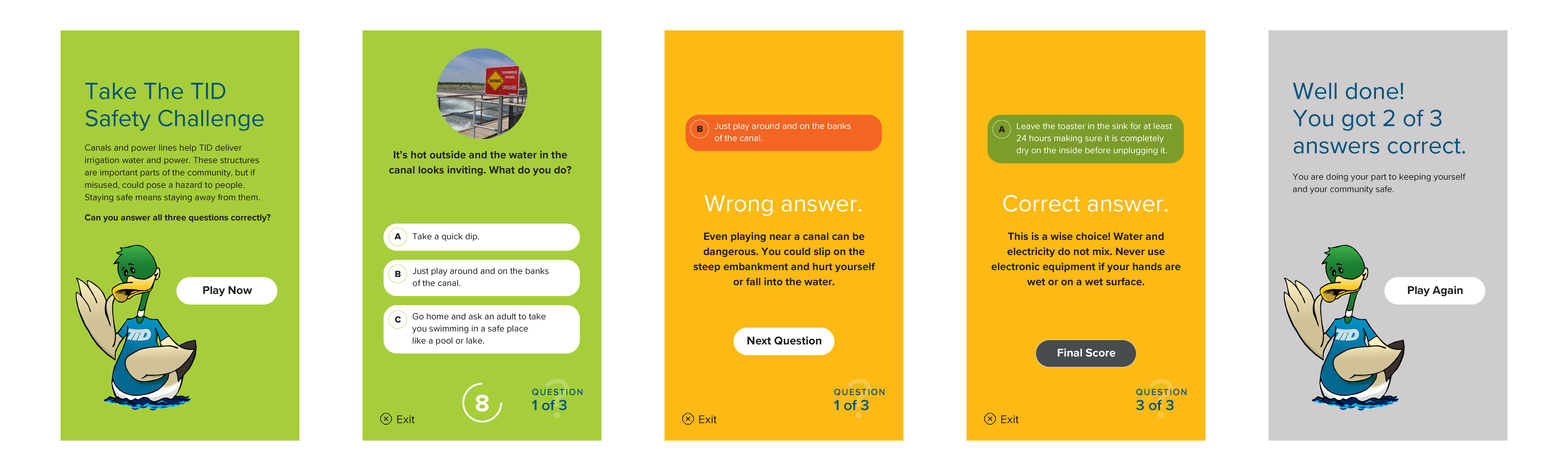
Touchscreens
The exhibit narrative document called for two touchscreens. The first, for company history and general information; the second, as an interactive safety quiz. Covive designed two custom interfaces with corresponding screens and navigation. Accessibility and readability were baseline considerations for color choice, text size, and on-screen button placement within ADA reach and viewing parameters. After incorporating ideas and content from the client team, Covive developed, tested, and refined custom code, installing and configuring the hardware devices during the trailer renovation process.
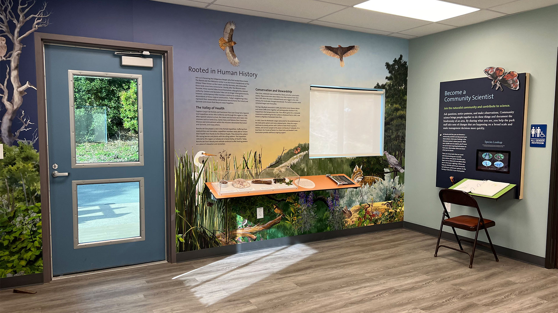
Finished Interior Graphics
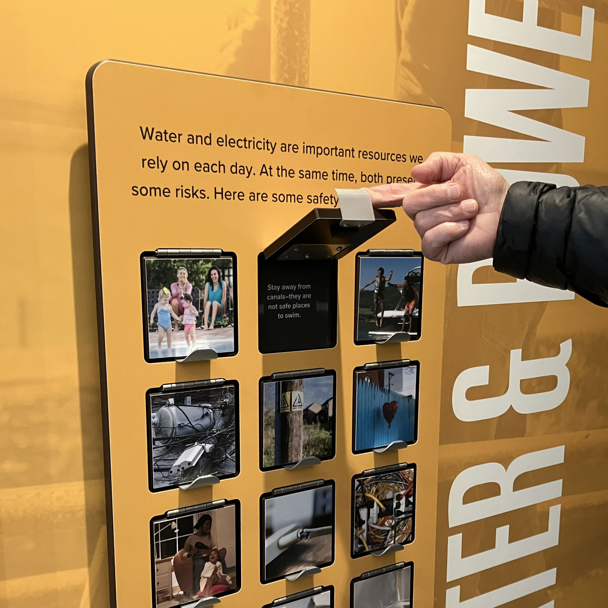
The finished exhibit components were ordered, fabricated, and installed by John Murray Productions. Background murals, wall-mounted panels and reader rails, as well as a durable flip-book, swing lid trivia, and pop-up tabs, harmoniously present an abundance of information in a small space. Supergraphic keywords reinforce top-level messages in a memorable way, while providing approachable, user-scale topics without overwhelming with T.M.I. The overall impact elevates the TID brand for an experience that is engaging for all ages.
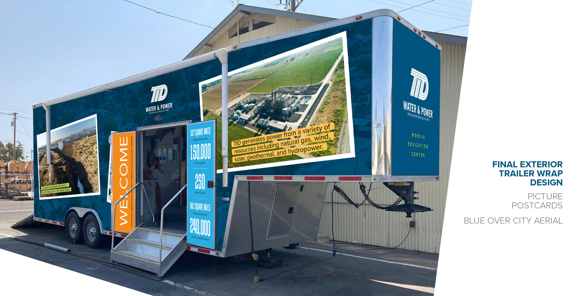
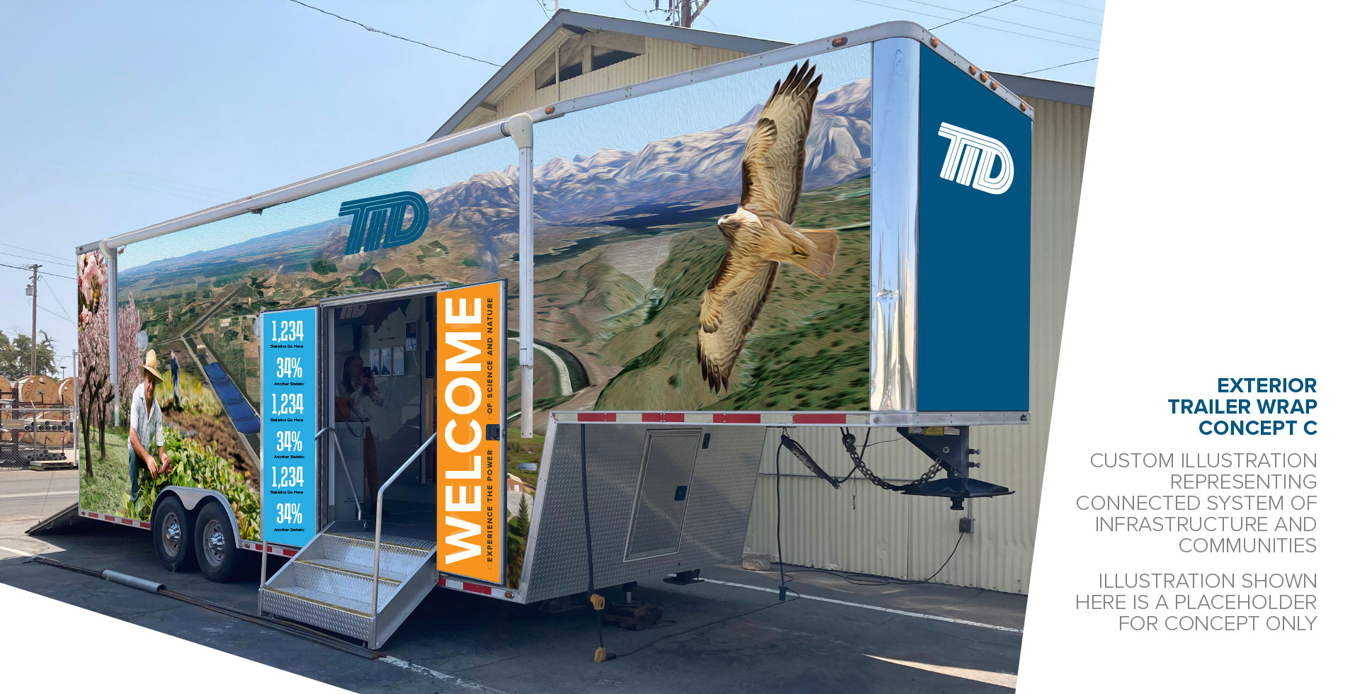
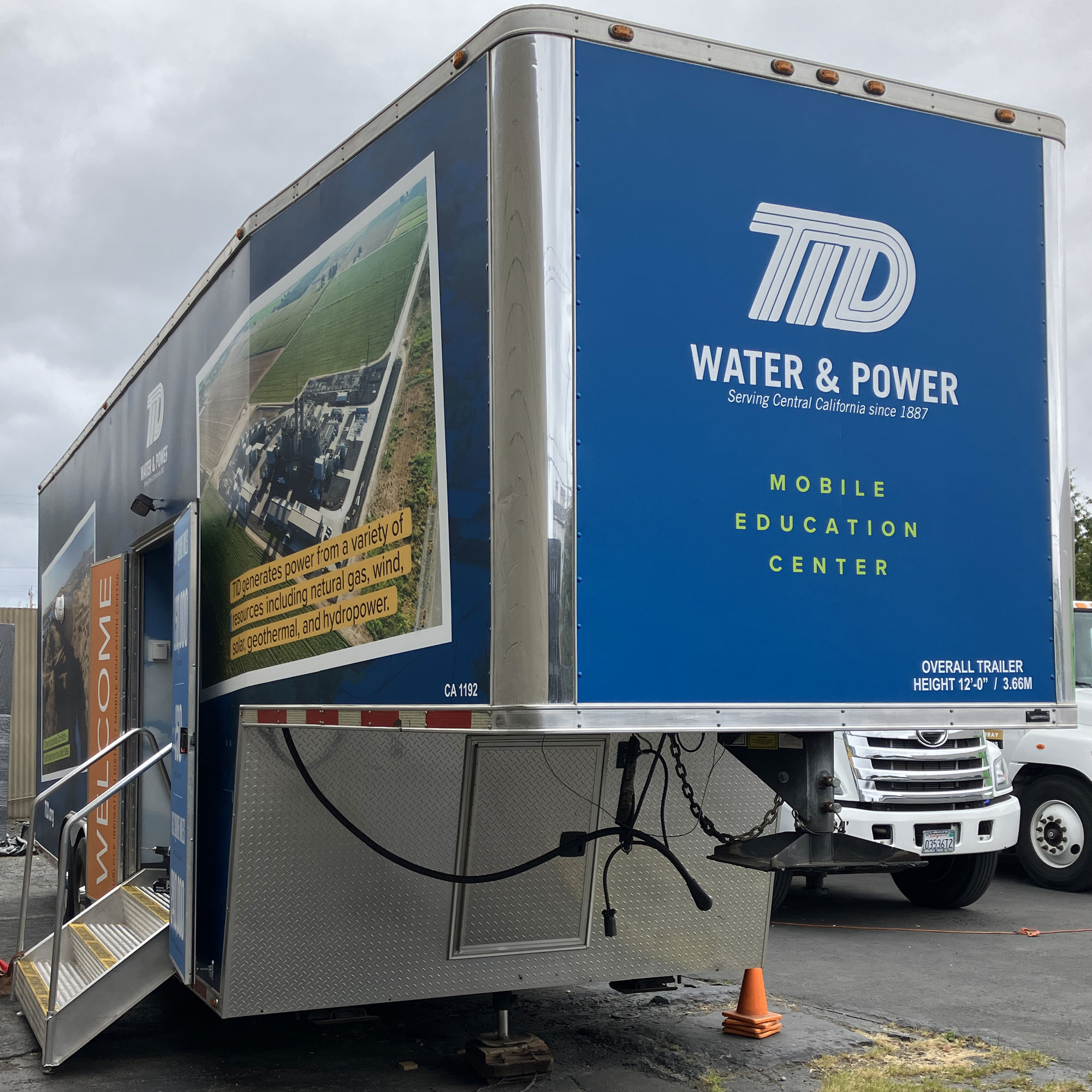
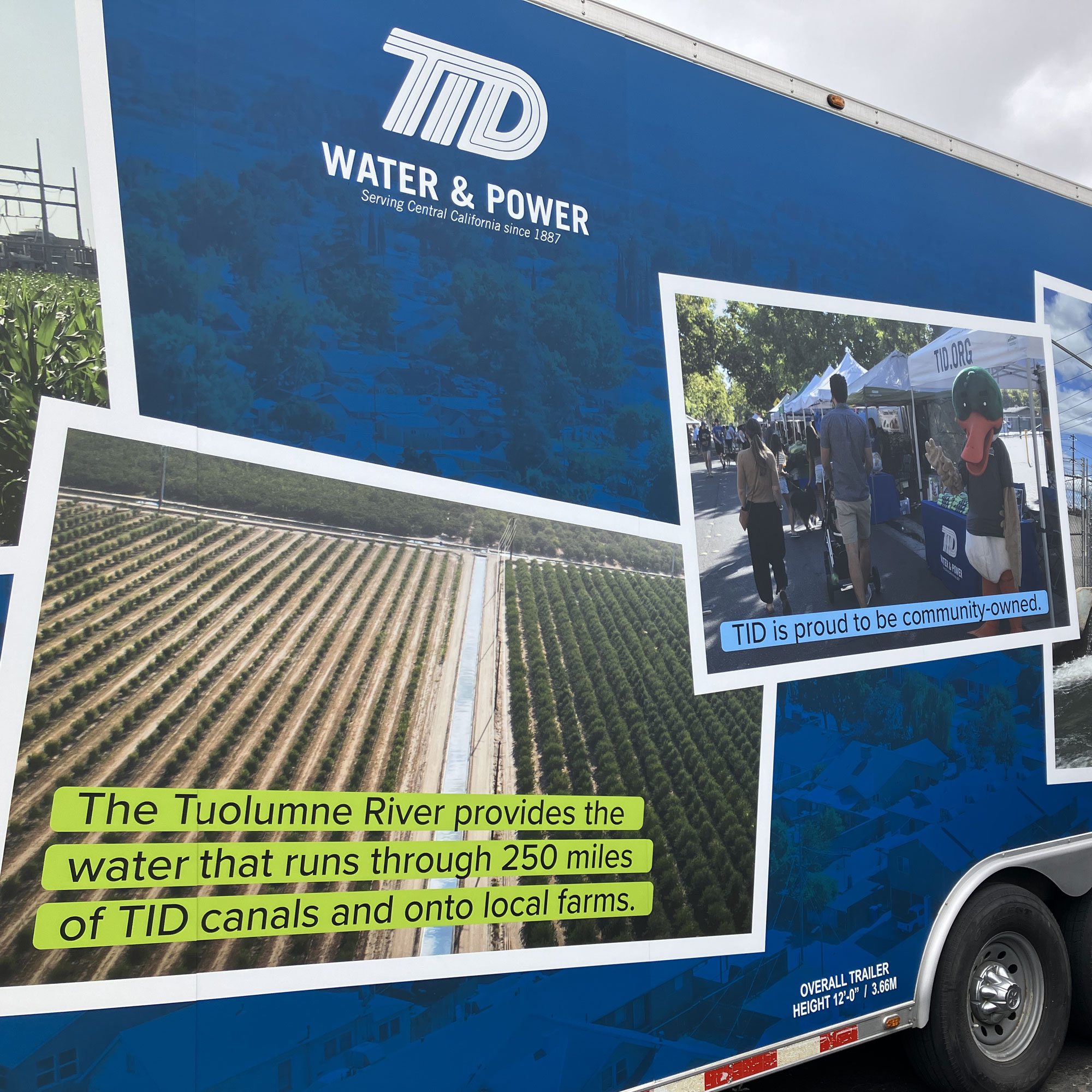
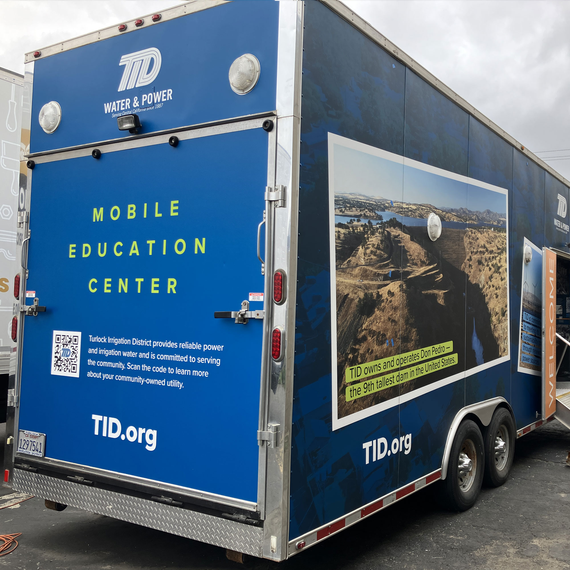
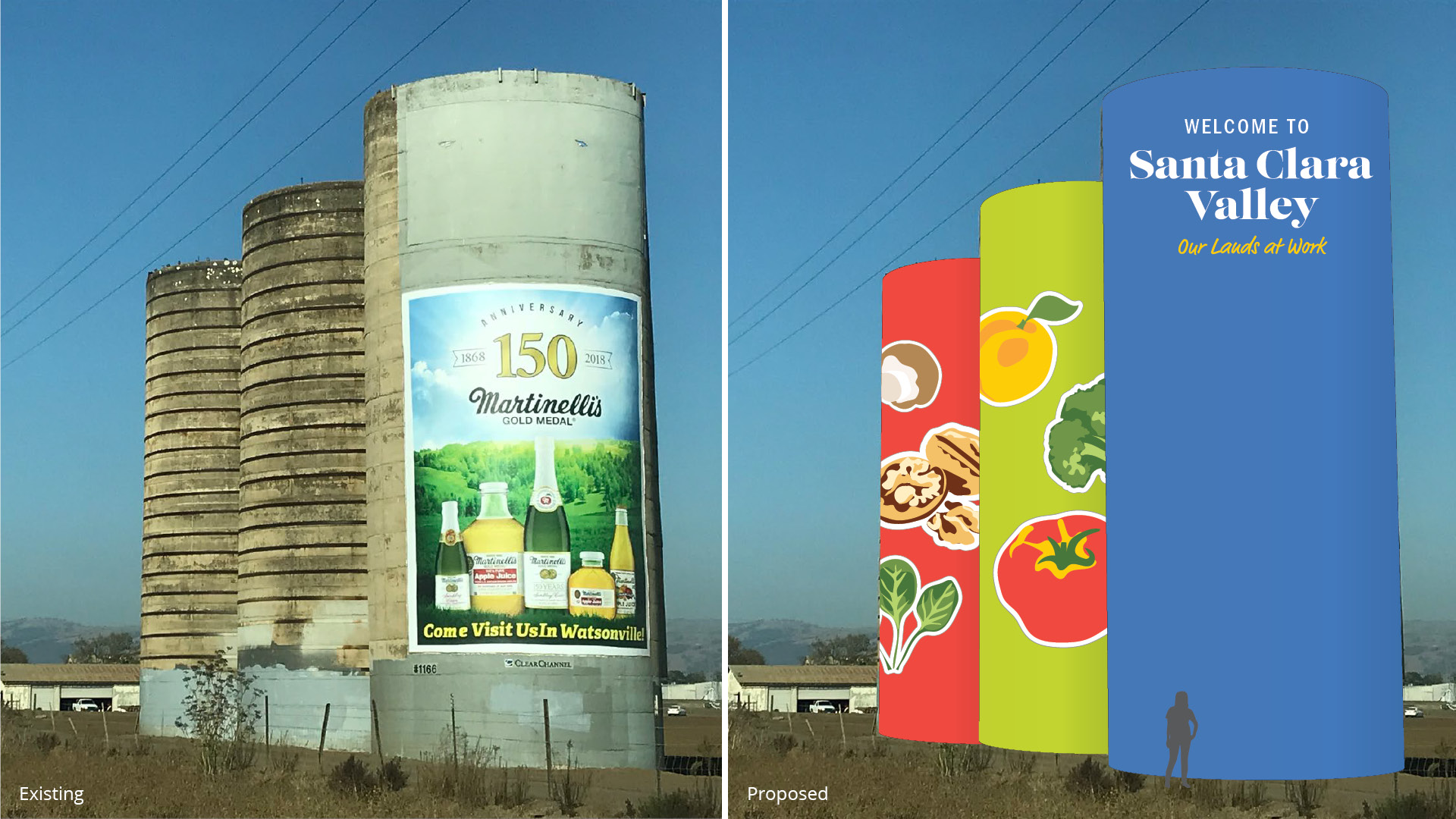
Exterior Trailer Wrap Graphics
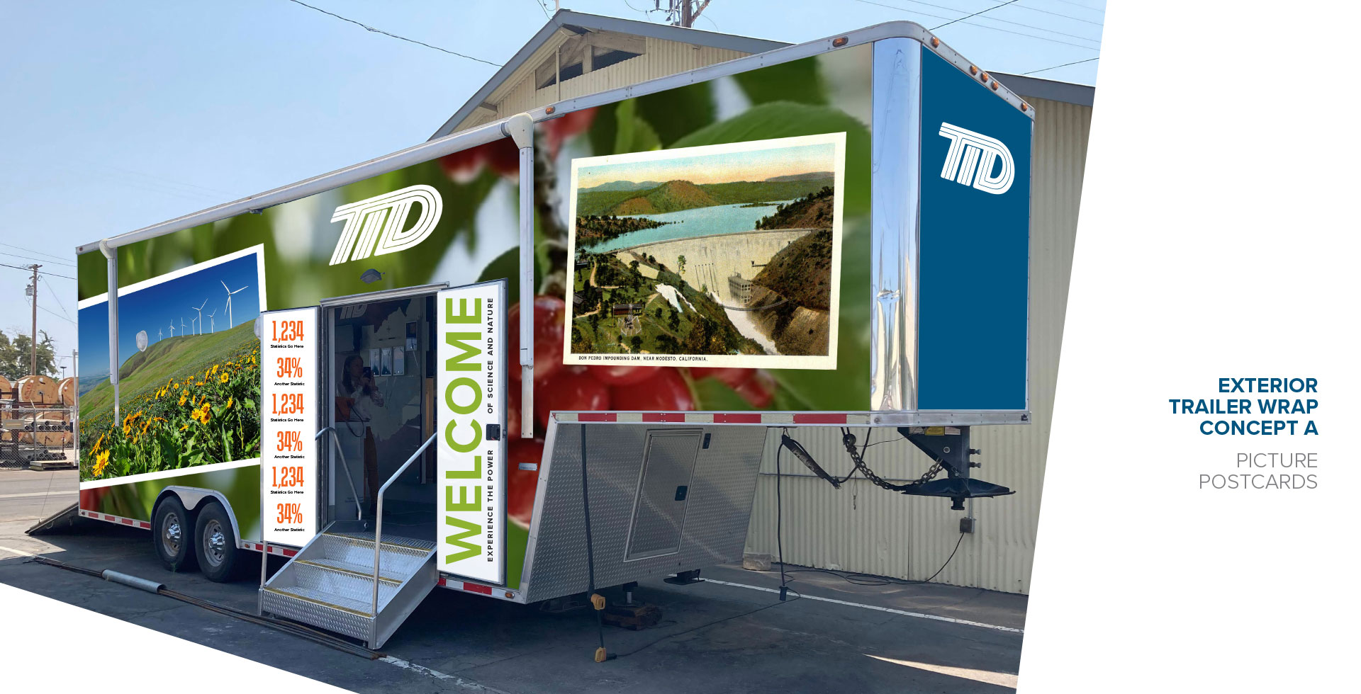
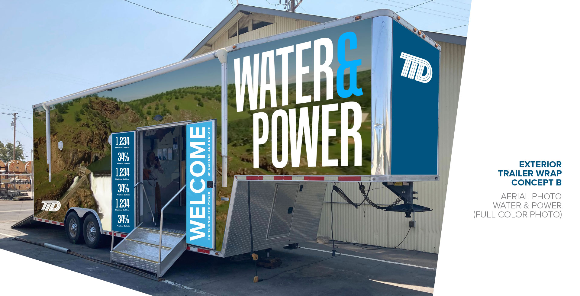
A refresh of the trailer’s exterior graphics was not originally part of the scope of the project. Covive made a case for redoing the exterior as a way to extend messaging and education beyond the vehicle’s interior, and as a mobile billboard for the company. A more colorful backdrop could also create shareable photo opportunities, aka selfie spots. Covive presented several design concepts, then refined a “postcards” concept showcasing the infrastructure and culture. Covive also identified the opportunity to present a welcome message and company statistics on the door panels, a surface which had previously been unaddressed. The result has striking visual impact from near and far, inviting visitors to step inside and rediscover TID.