







Sonoma Botanical Garden
Seasonal Campaigns
Ribbit Exhibit — Spring/Summer 2024
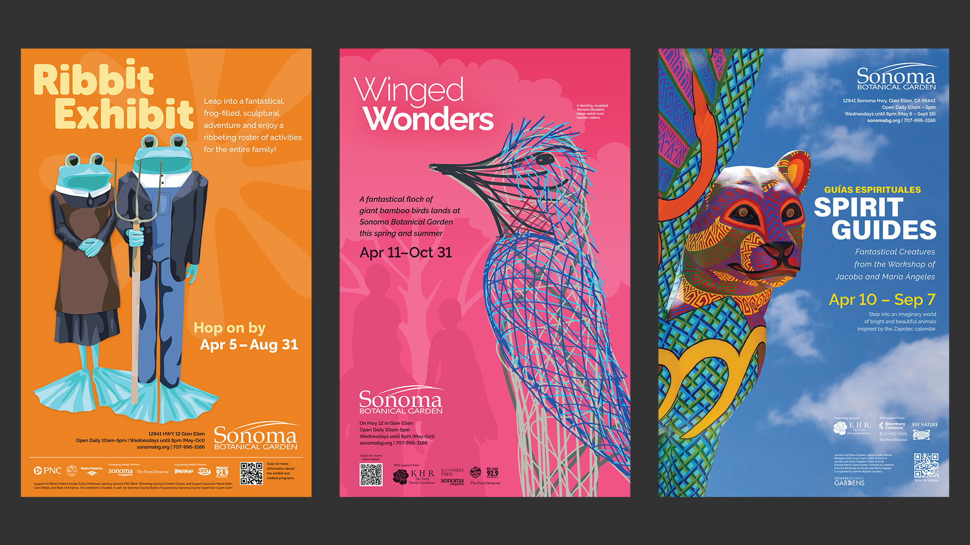
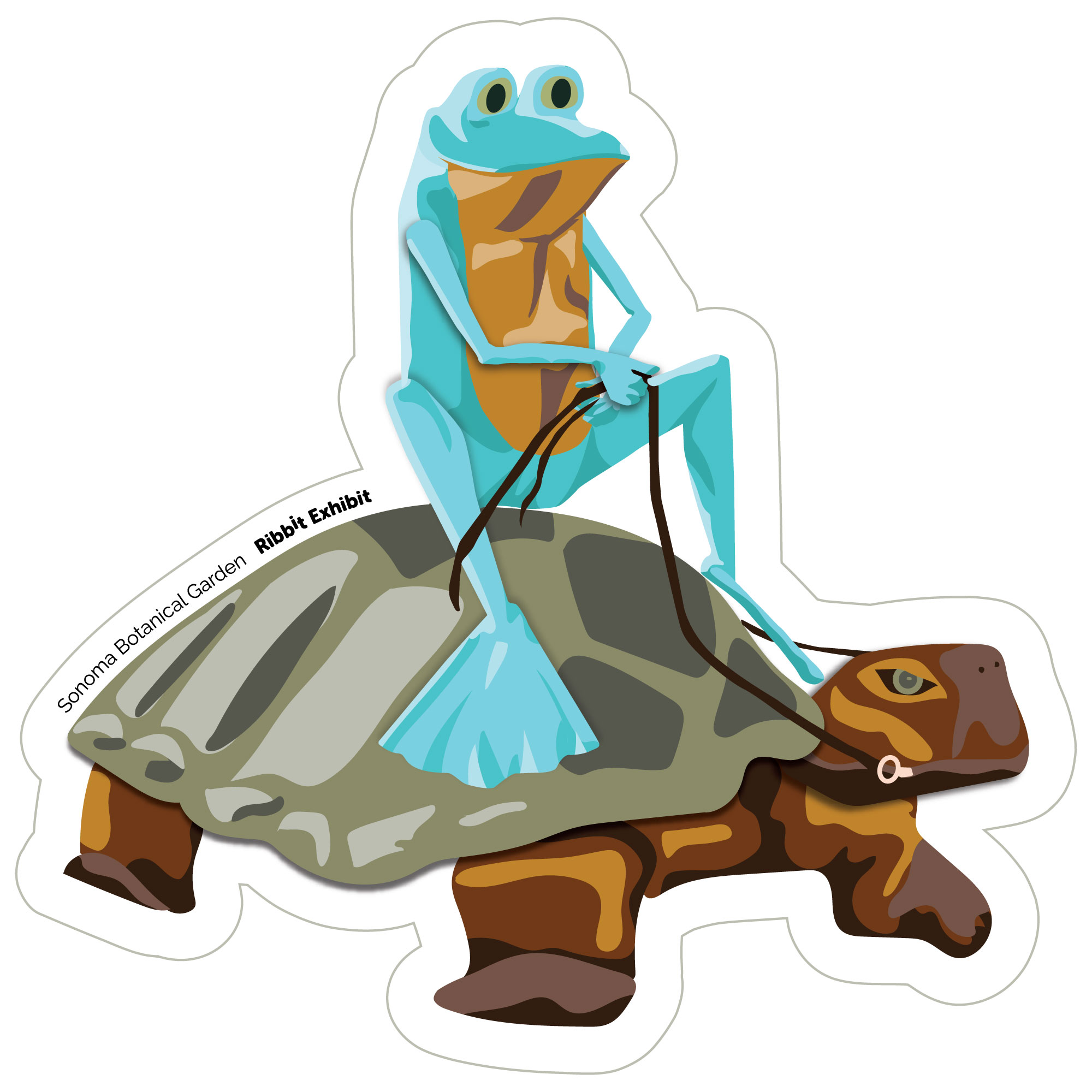
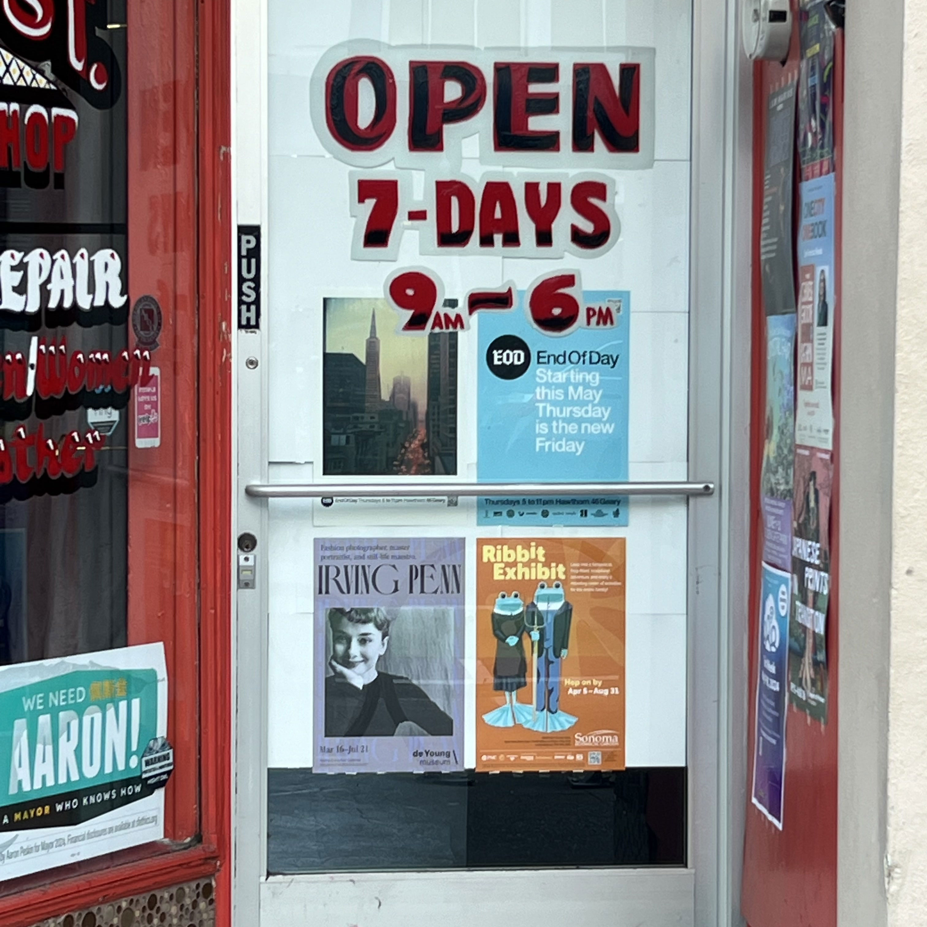
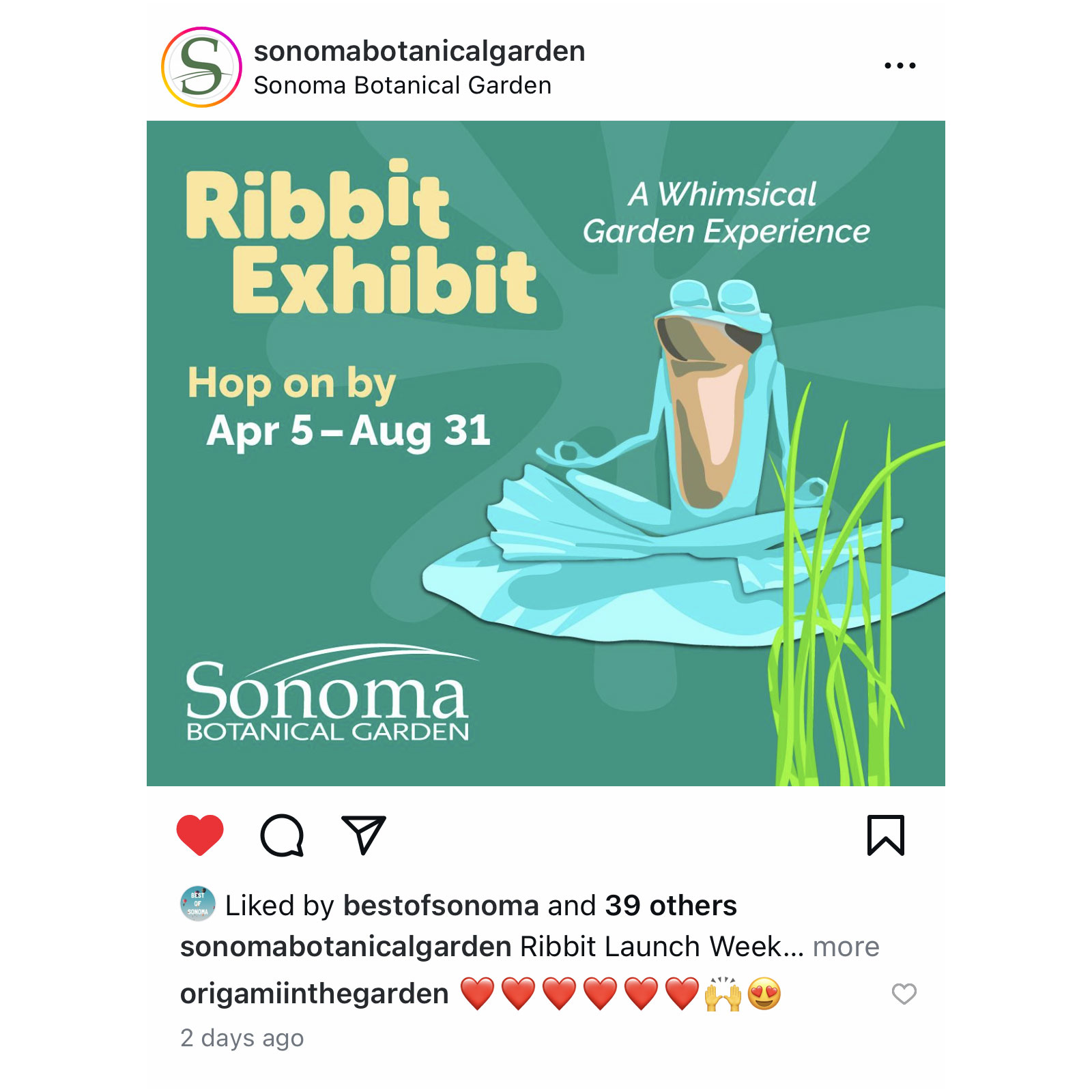
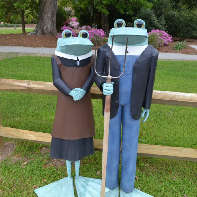
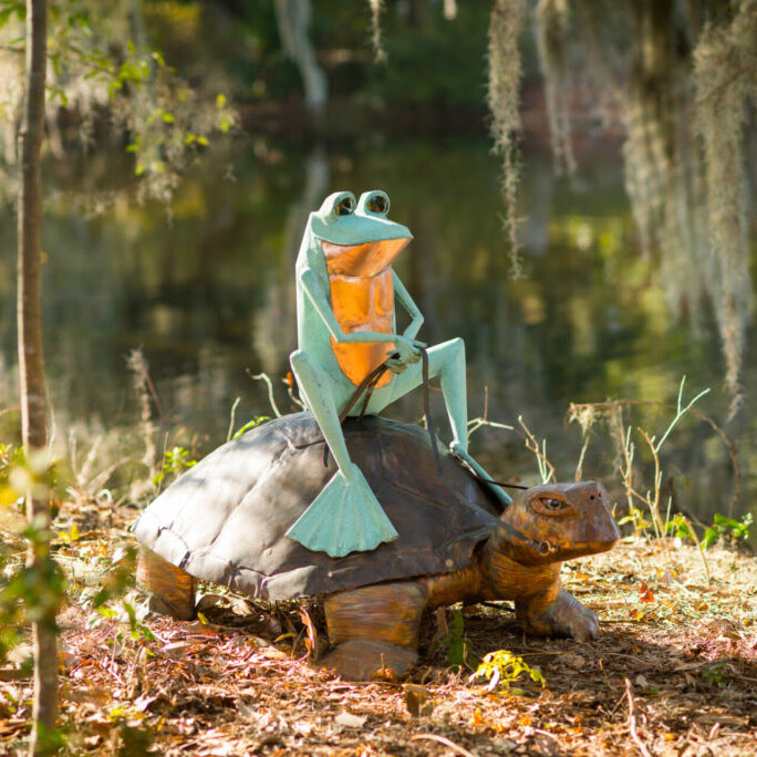
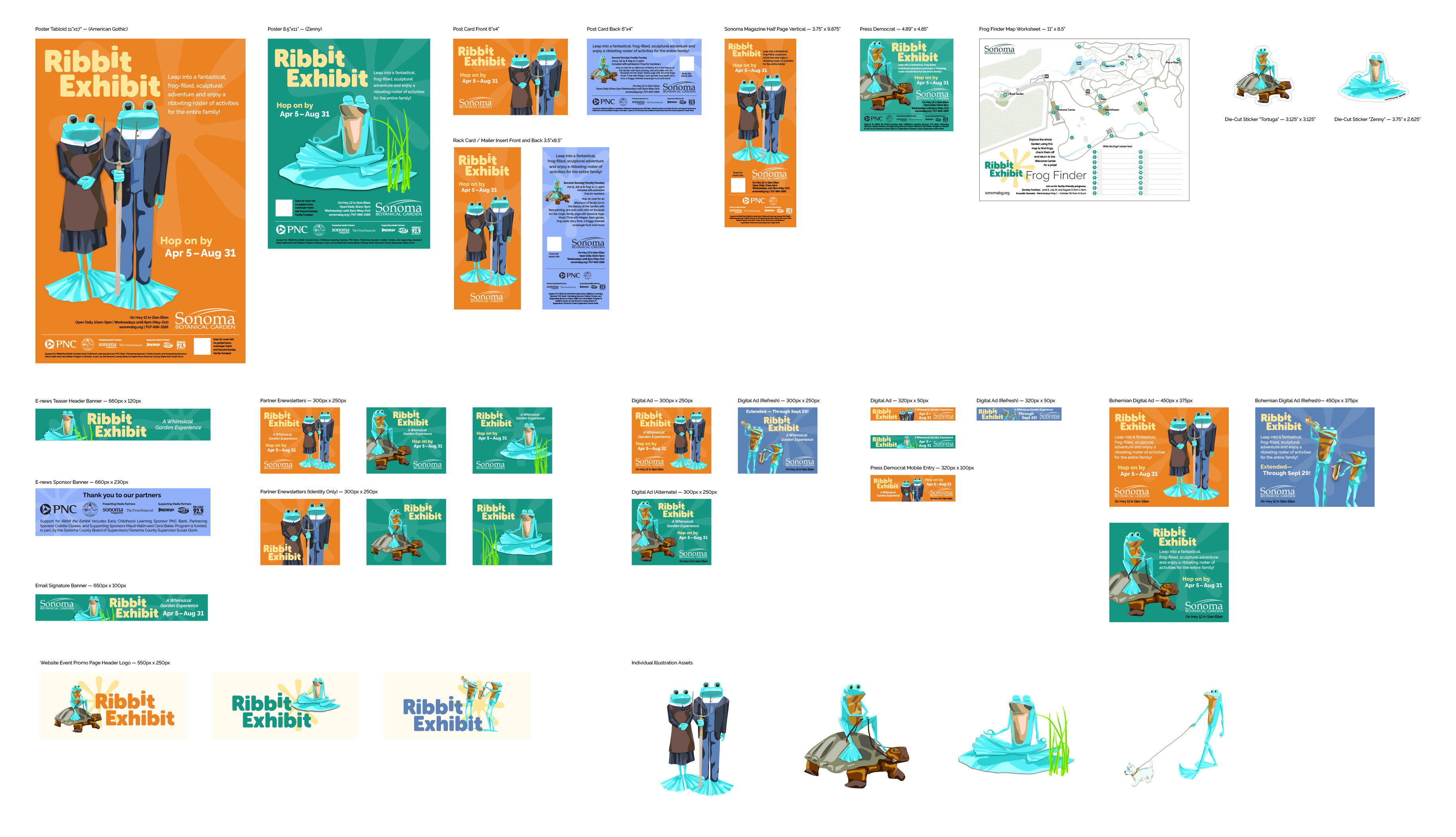
The garden’s first major summer exhibition brought a collection of more than a dozen playful human-scale copper sculptures of frogs sporting a range of poses and personalities placed throughout the garden. This “Ribbit Exhibit” gave visitors a new reason to visit the Garden, guided by a “Frog Finder” map handout to locate them all. Rather than use literal photography of the sculptures, Covive built curiousity and delight by presenting the artworks as graphic illustrations (each traced from photo reference) in promotional materials which included tabloid posters, flyers, post cards, rack cards, and print and digital advertising. Stickers were produced using the illustrations as a reward for completing the frog finder challenge. The exhibit was a great success, boosting visitation and raising the profile of the garden as a regional must-see.
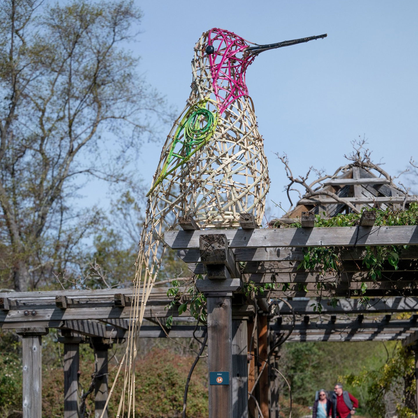
Winged Wonders — Spring/Summer 2025
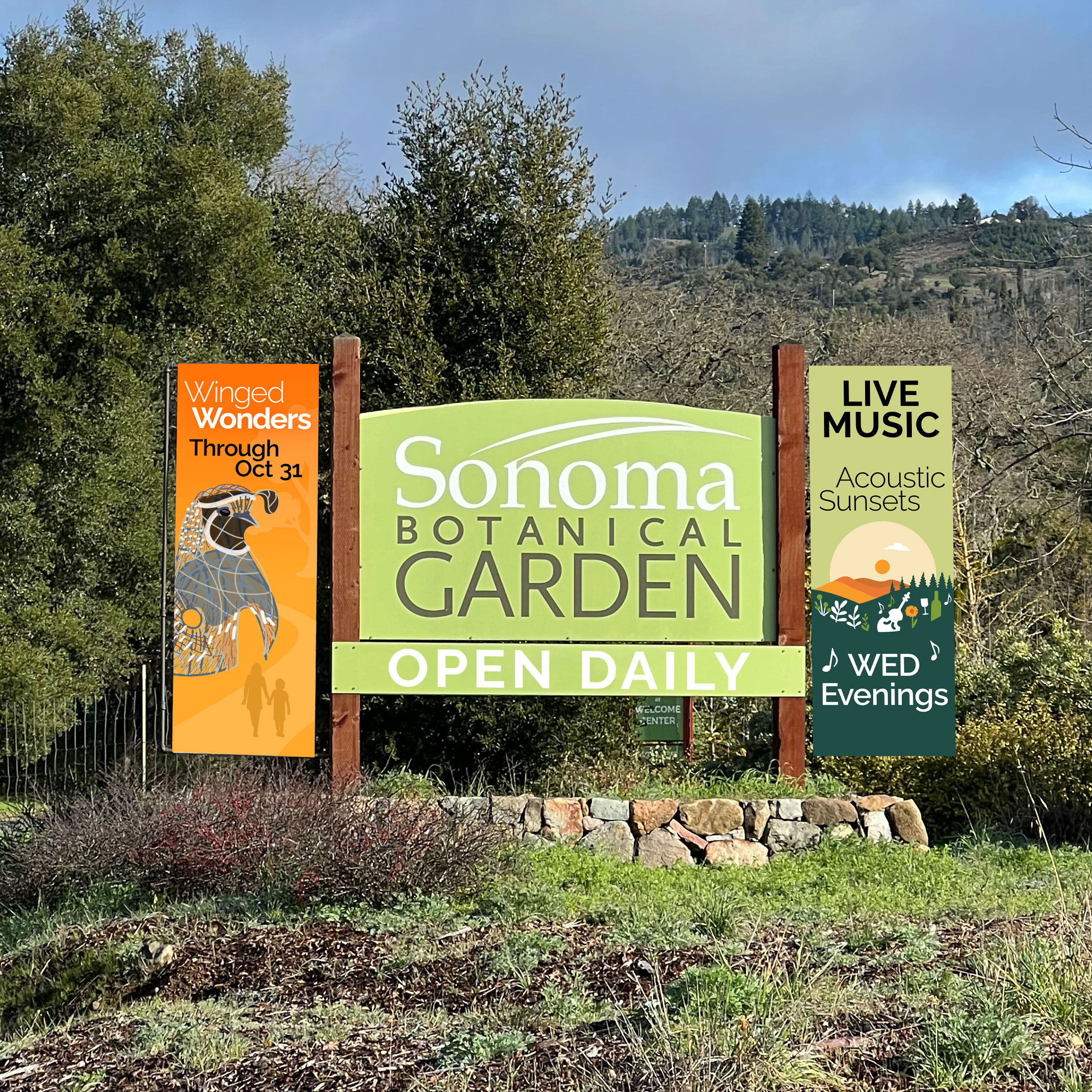
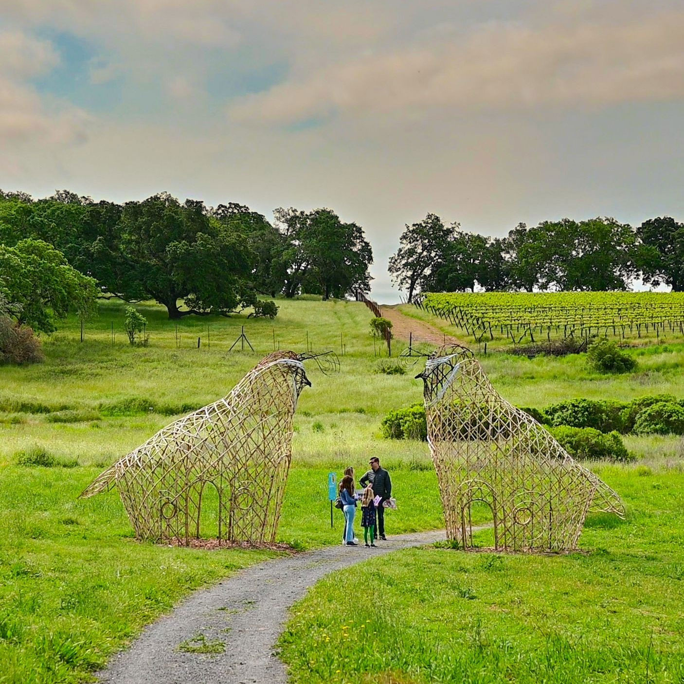
To promote Winged Wonders, Covive created sketch illustrations to represent giant bamboo sculptures of birds of a range of species. Some were built off site by the artist team, others were constructed on site. Covive referenced sketches and source photos to design the campaign graphics. A simple wordmark uses repeating uppercase “W”s with overlapping center strokes to evoke the feeling of wings. To demonstrate scale, colorful gradient backgrounds include subtle silhouettes of families or environmental features. The campaign included two phases with a spring launch and late-summer refresh with additional colors and illustrations. Membership and visitation set new records for the Garden over the course of the exhibition.
Installed artwork photos by @daniel_perales_studio


Spirit Guides — Spring/Summer 2026
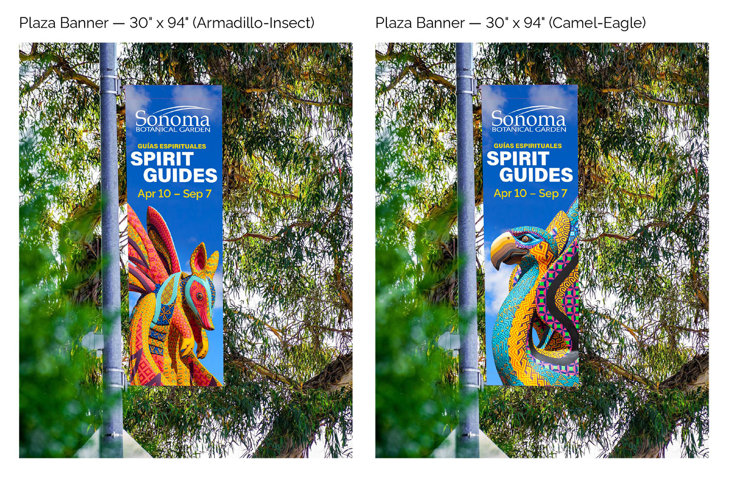
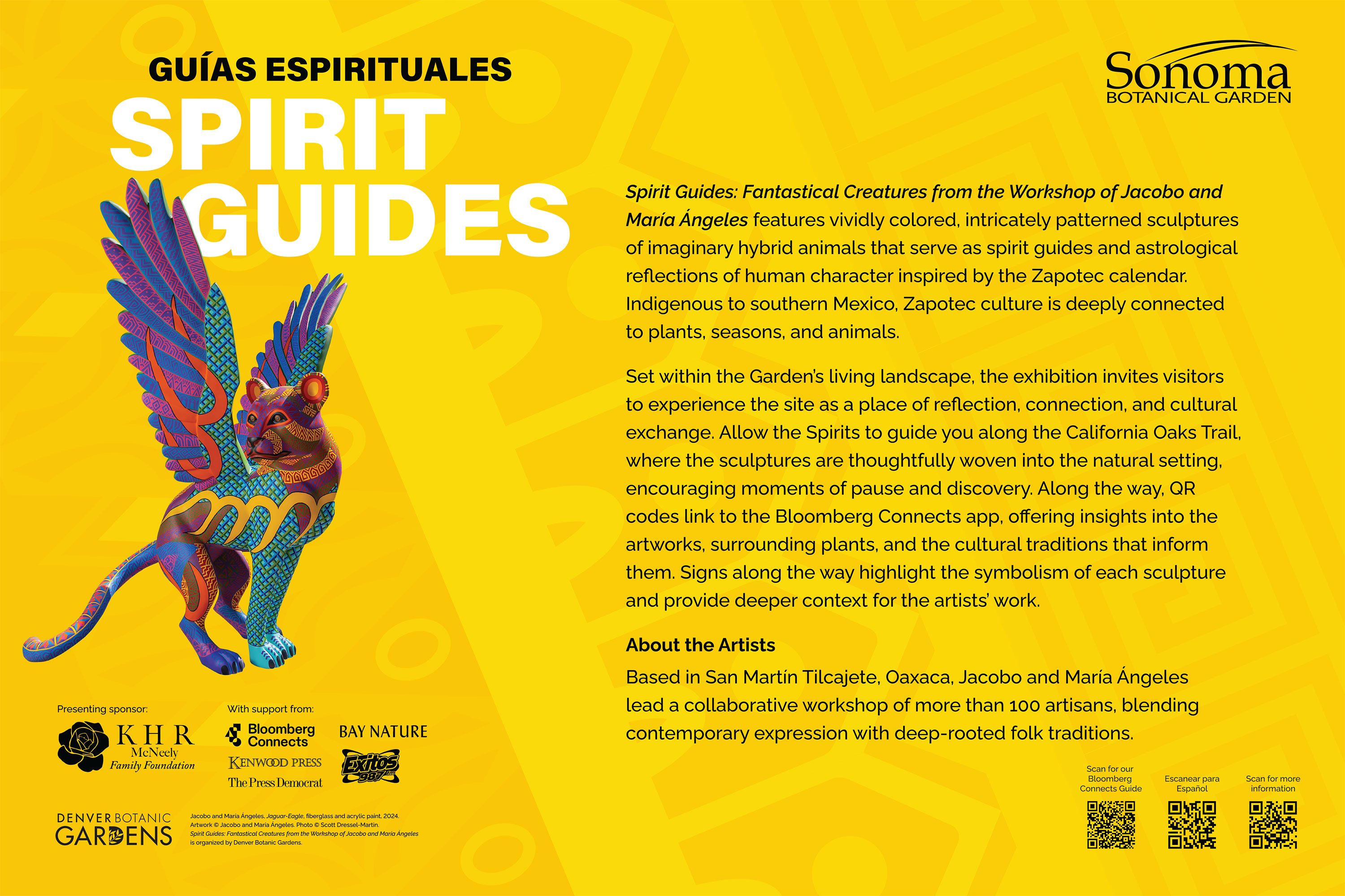
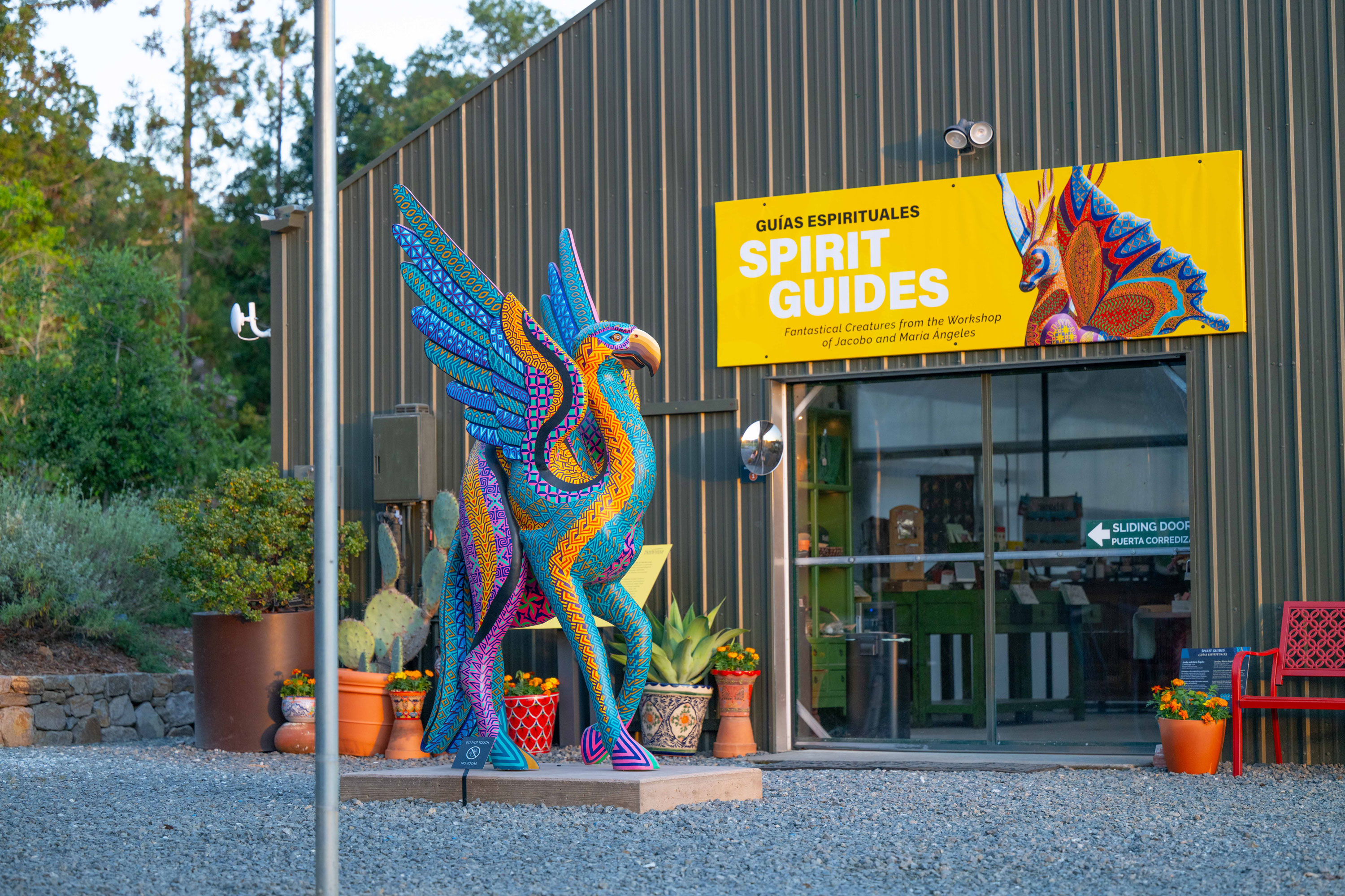
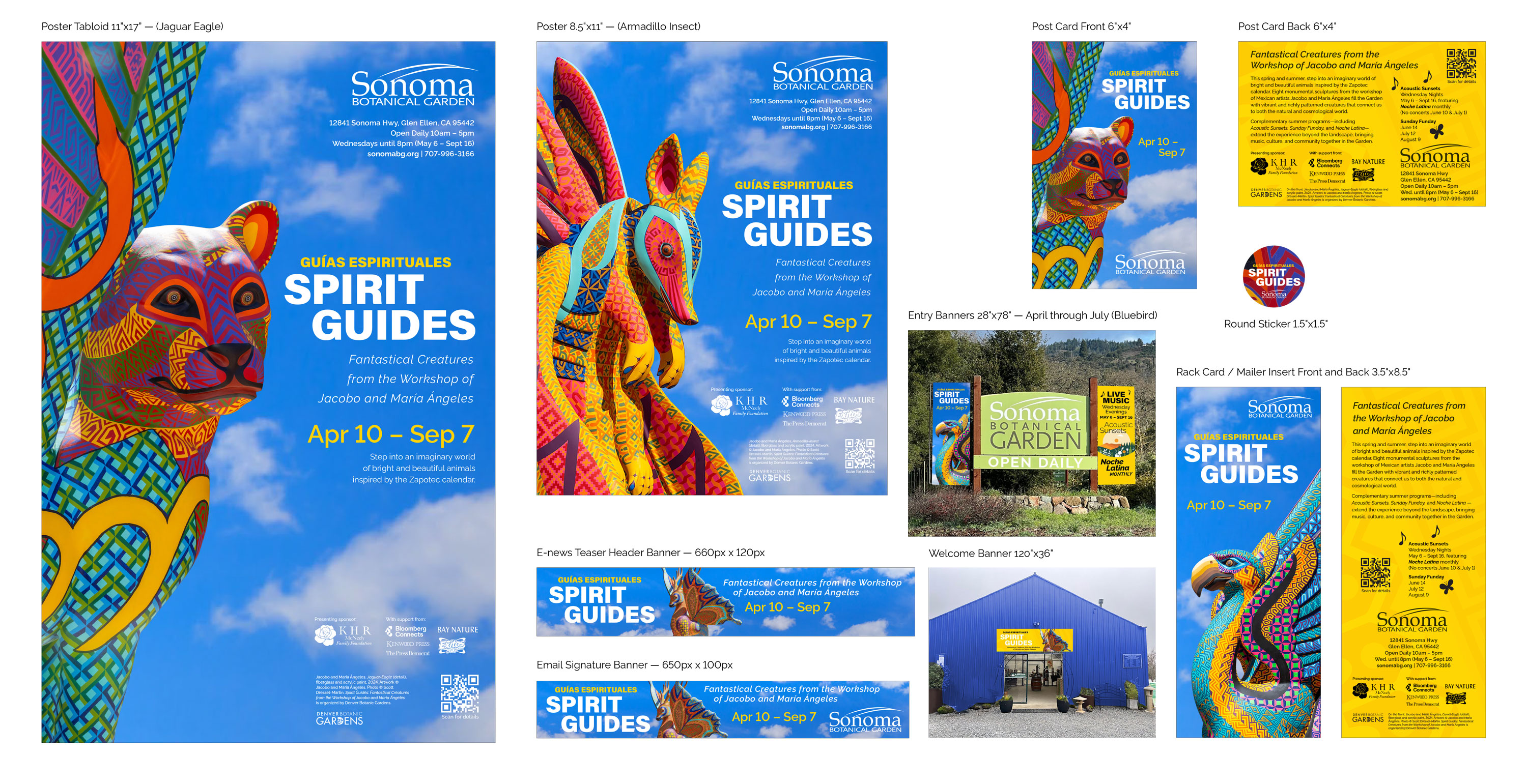
Spirit Guides: Fantastical Creatures from the Workshop of Jacobo and María Ángeles features brightly colored, richly patterned sculptures depicting imaginary hybrid animals that serve as spirit guides and astrological embodiments of human character. Inspired by the Zapotec calendar, the exhibition includes eight large-scale works organized by Denver Botanic Gardens. Covive unified the campaign by presenting existing high resolution photography of the artworks clipped on a blue sky with clouds background, giving the campaign an outdoor and ethereal feel. An accent golden yellow background pattern brings vibrance to signs and two-sided materials.

Bonsai & Blossoms — Winter 2026
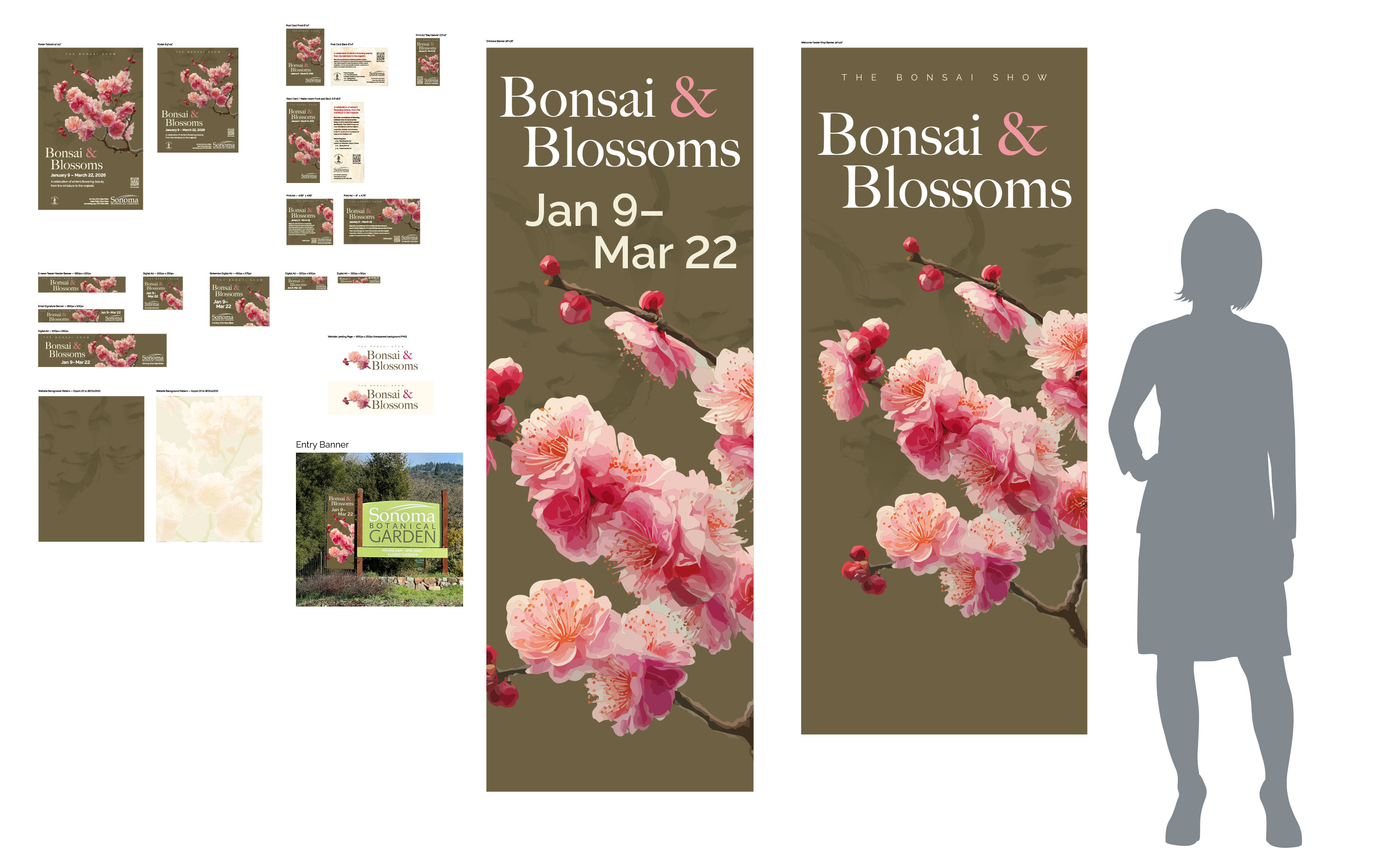
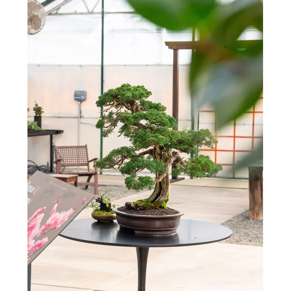
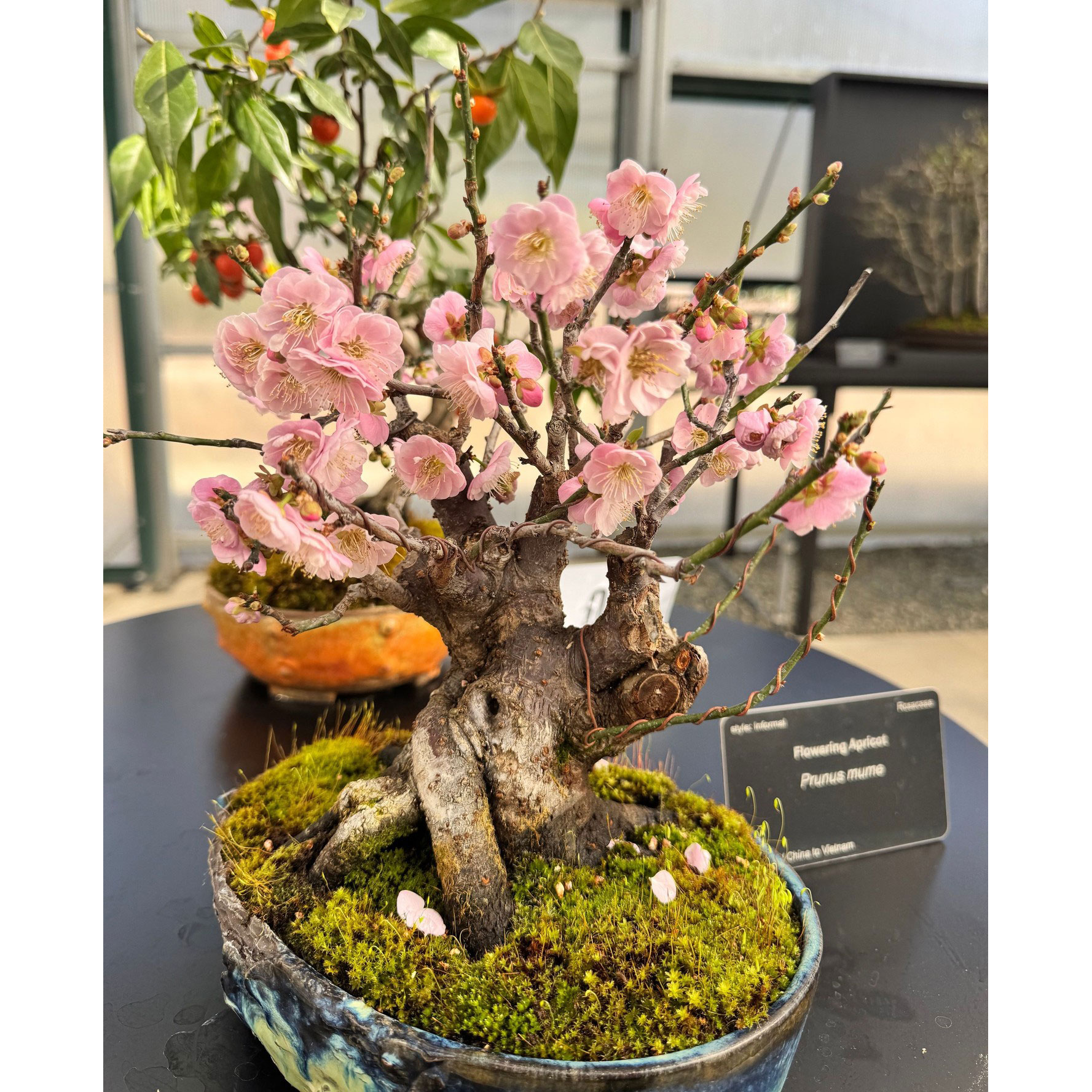
For the third annual winter Bonsai show, with a theme Bonsai & Blossoms, Covive showcases a detailed illustration of a blooming cherry branch on a rich, warm, milky brown background. A secondary theme of the exhibition is hanami, the tradition of viewing and appreciating flowers. A brush stroke illustration of faces provides a subtle and peaceful layer of meaning behind the bright pinks of the branch. Print and digital graphics promote the exhibition, where interpretive panels provide background on the traditions of bonsai and hanami for visitors.